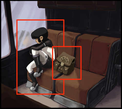
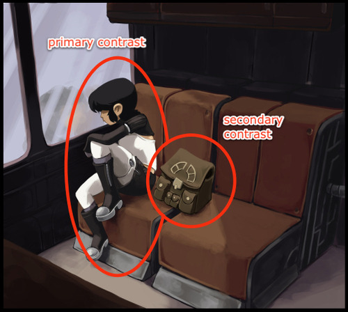
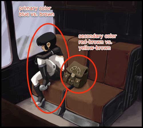
In painting and general illustration, there are some basics everyone should know about composition. Chief amongst these is the importance of a focal point. A focal point is the primary focus of a picture, whether it’s a person, object or simply an abstract portion of the image. Humans have binocular, mammalian vision and our action of “looking” instinctively relies on focusing, not just seeing. Unless we’re looking at a magic eye 3D image, our eyes are only really comfortable with an image that has a clear focal point. Once that’s clear, we allow our eyes to wander and take in the other details.
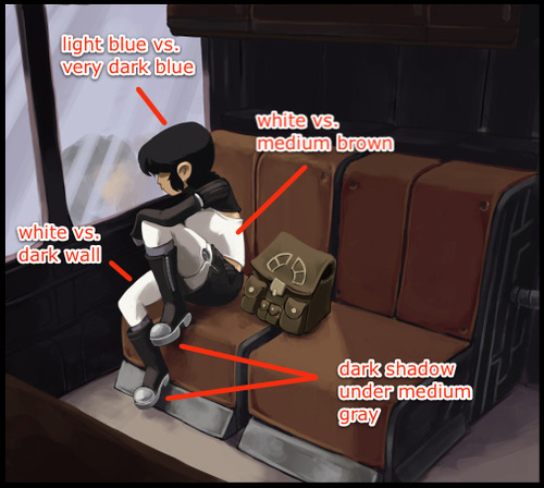
Achieving a solid focal point isn’t terribly difficult. A few tools that will help are contrast (overall the most indispensable):
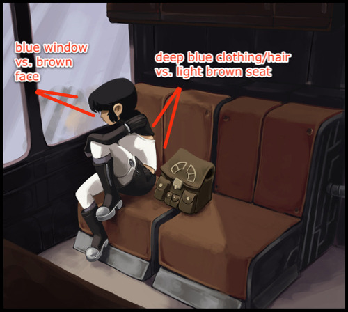
Complementary Colors (a subset of contrast):
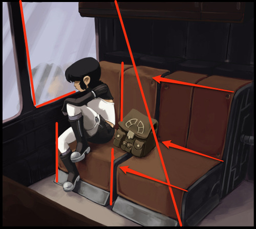
And overall structure:
However, these are the conventions of painting and illustration, which have somewhat different goals from comics. Comics, even in a single panel, employ the art of the visual narrative, which means there are unique demands for guiding the reader’s eye. Having a single focal point can be enough for some panels or images, but oftentimes it’s necessary for comics to employ multiple focal points in a single image to not only draw the eye in a meaningful, sequential fashion but also to heighten the reader’s excitement and immersion in the story.
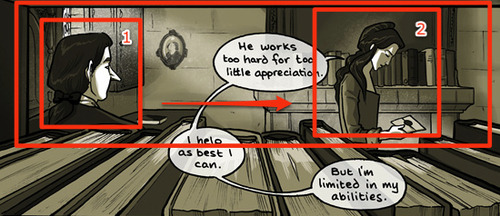
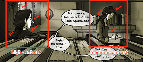
“Sequential art” doesn’t just refer to a sequence of panels, individual images also lead the eye in a sequential manner. There is a hierarchy of focal points that guide the reader through the visual narrative. In the above panel from Family Man, we see the above “focal point” tools being used to create a nice frame, but from there the composition is divided further, first focusing on the man, and then to the woman. A clear hierarchy within the visual sequence is established with some more advanced techniques.
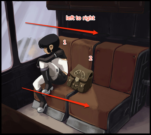
Gazes moving from left to right:
In Western comics, panels and text are read from left to right, so it’s in the best interest of the artist to take advantage of this natural habit of the reader’s eye. Unless forced to do otherwise, the reader is going to look at the top left corner of a comic image and move to the right. A reader will also instinctively look in the direction a character is looking, and in this panel the artist is taking advantage of both of these habits. We start on the man, who is looking at the woman, upon whom we then focus.
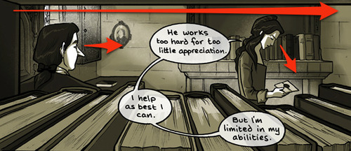
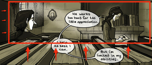
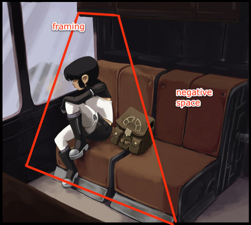
Framing:
There’s a frame created by the books and bookshelf that keeps the eye from drifting downward. This reinforces the previous technique of moving the eye from left to right. (Notice too the slight dip in books near the woman’s hand, drawing the eye to a third and softer focal point, ie: the letter).
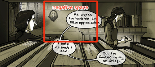
Soft division through negative space:
What largely separates the two focal points is a low detail negative space, where the contrast is low and the eye doesn’t linger. It also creates a 3D triangle of sorts: if we were shooting lasers out of our eyes, they would start at the man, ricochet off the wall and hit the woman.
Primary and secondary contrast levels:
It’s subtle, but the values surrounding the man are more contrasted than the woman. This largely serves to reinforce the tools previously mentioned.
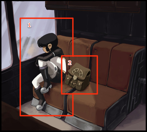
These types of techniques are also prevalent in the first image I showed, with Kimiko being the primary focus and her bag the secondary focus:
As you can see, the tools needed are slightly different, partially because of the larger colors used and other compositional requirements (for example, the image with Kimiko has a more complicated frame because it uses a 3-point perspective instead of 1). The point to take home is that there’s no one way to make this work; you may use some of these tools and not others, depending on what the image requires. Additionally, it should be noted we’re not limited to two focal points. Depending on the comic, there could be more. It all depends on what the visual narrative requires.
This is the key: no matter what the style, comics are a visual narrative. If we establish a clear sequence of visual relevance, the reader’s eye is active and their mind is engaged. Pull them into your world and keep them for a while.
