There’s a wide variety of approaches when it comes to environment designs in the comic medium, and although there are certain key elements that divide comics from motion media, it’s somewhat useful (in the case of environments) to place comics in two basic camps: film vs. sitcom.
Modern newspaper strips, especially the gag-driven variety, employ environment conventions similar to that of sitcoms. Sitcoms trace their origins to stage and radio performances, where the focus is very much dialogue driven. Most of the physical action is exclusively between the characters, and it’s very rare for the actors to turn their back to the audience (partially because their voices need to project in the direction of the viewer). As such, the “sitcom” variety of comic strip often employs minimal visuals when it comes to environment, as the primary goal is to deliver a verbal punchline. There are some excellent examples of this style of comic strip, though I personally feel this approach is overrepresented in American comics, especially the web variety, and it’s often employed for comic styles that don’t benefit from this minimalism.
There’s another breed of comic, however, that parallels more closely with film. Because of the nature of the medium, film is inherently (though not exclusively) more location-driven than the stage, and comics of this style in turn rely on a stronger connection between the characters and their environment. Comics are about efficiently conveying concepts and moods, and this style demands an intimate connection between reader and the world being presented by the cartoonist.
In the above page by Enrique Fernández, a significant amount of information about both the character and his environment is being conveyed. Aside from the more obvious elements like the character’s personality being conveyed through body language, there’s a lot the environment is implying. The top panel introduces a distant vanishing point behind the man, giving the impression that he’s traveled far to reach this point. The low angle of panel #2 emphasizes the height of the action as well as the potential distance (and danger) of the fall. The dark shadows and narrow spaces of panel #3 indicate a change of mood from freedom to impending danger/detection (the narrow band of “light” space cutting through the panel and the character’s silhouette is especially powerful). The final panel emphasizes that the man does not want to be seen; the wall seems to be pushing back against him, trying to shove him out of frame. We want to know what he’s looking at; we were set up with the previous panels with a sense of motion, and now though he seems to be frozen, the environment now has become the primary actor. We’re drawn in without a word of dialogue.
Fernández is also good at establishing an environment as a character unto itself.
As is the case with the above page, oftentimes a story requires that the setting be much more than a place upon which the plot unfolds, but an active participant in the antagonism or encouragement of the characters. In the end, regardless of the specific purpose, it should always be about engaging the reader, inviting them into the world you built and keeping them interested in the unraveling of the narrative.
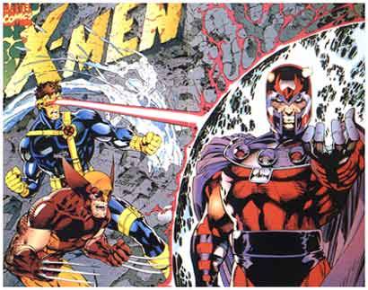
Superhero comics, oddly enough, should benefit from this greatly but it’s rare to see it effectively employed. There tends to be an immense focus on the design and posing of the characters with very little attention paid to how those characters are interacting with the environment. Ironically, western superhero books seem to take their cues from the sitcom school, where more often than not the characters seem to be posing for a photograph that no one’s taking.
Obviously I’m not dismissing all superhero comics, but it is a dominating trend in the most popular styles. There are, however, some powerful exceptions, like the masterful Frank Quitely:
The important point here is that it’s essential to decide what tools work best for the comic at hand. Mismatching approaches is an easy mistake to make, but it can carry extensive consequences.