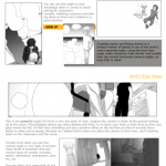


Tips on color & light from The Artist’s Guide to Color by Wendon Blake
Wow this is…. actually super helpful! Reboggling for future reference :U
Tips on color & light from The Artist’s Guide to Color by Wendon Blake
Wow this is…. actually super helpful! Reboggling for future reference :U
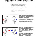
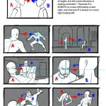
Hey kids! If you’re a filmmaker, animator, or storyboard artist and you don’t know what screen direction is, you might want to read this.
For the record, there are always exceptions to the rule in filmmaking, which is why I pointed out 3 examples here.
I’ve also found that comic books tend to NOT take screen direction as seriously as film does, but I’m still on the fence if this is wise or not. My favorite comics pay close attention to screen direction so as to not confuse the reader.
Good luck!
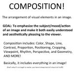
Today I gave my students a quick presentation on some of the basic considerations for composition, which I am now sharing with you! I’ve given them separate talks about color and tonal value/contrast, which are also super important compositional concerns. (I’ll be sharing those presentations too once I properly format them)
I personally love learning about different compositional techniques. It’s fun to think about the ways that the brain views & sorts images, and how we can trick it into feeling a certain way or looking at certain aspects of an image first! It’s easy to fall into compositional ruts (which I am also guilty of) because a lot of art gets by with mediocre, though serviceable, compositions. If you can generally understand what’s happening in an image then it’s generally fine. However, it’s the truly great compositions, where everything in the whole image has been considered and ‘clicks’ together, that bump up an illustration to a visual slam dunk. NC Wyeth is one of my favorite artists for this reason: his compositions are rock solid, varied based on the image’s intent, and always enhance the mood or action he is depicting.
For extra reading, some online compositional resources that I’ve found helpful or interesting include:
Creative Illustration by Andrew Loomis (download it for FREE. Such a great book all-around.)
Gurney Journey (check out the “Composition” tag, but really everything he posts is great)
The Schweitzer guide to spotting tangents
Cinemosaic (a blog by Lou Romano with some truly WONDERFUL compositions captured from various films)
Where to Put the Cow by Anita GriffinHappy composition-ing!
A solid breakdown of the fundamentals of composition, complete with examples!
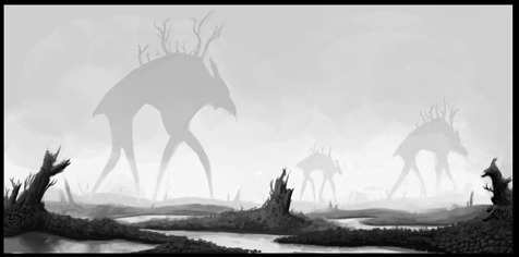
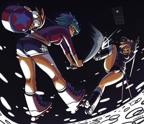
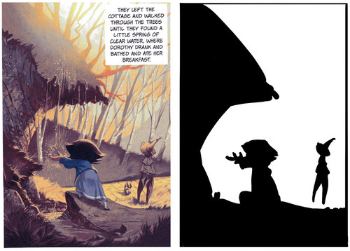
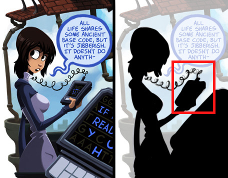
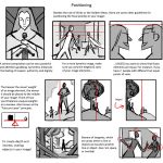
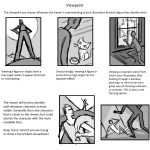
The eye isn’t a camera. When we view objects, especially moving objects, our brains tend to break them down not into a collection of varying hues, but rather silhouettes. Quick object identification is a primal evolutionary necessity, and it’s a foundational way our visual interpretation works. It’s why camouflage works too.
When an object’s silhouette is difficult to make out, we have a tough time keeping track of what we’re seeing. It’s why so many comics and drawings use the visual shorthand out outlining figures and objects. The shades and values of an object are secondary to the basic shape when it comes to recognition. As such, effectively managing silhouettes is a vital tool for visual narratives.
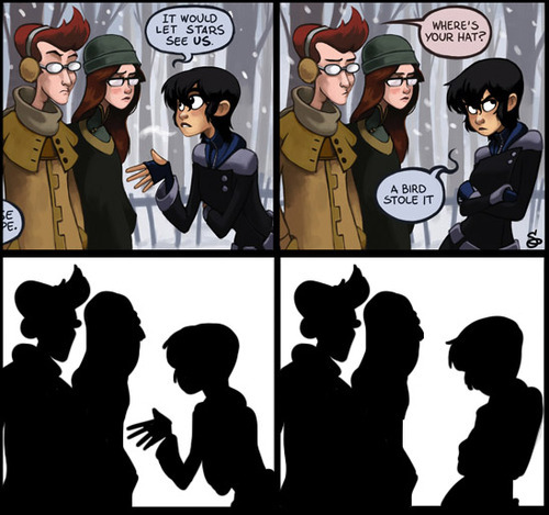
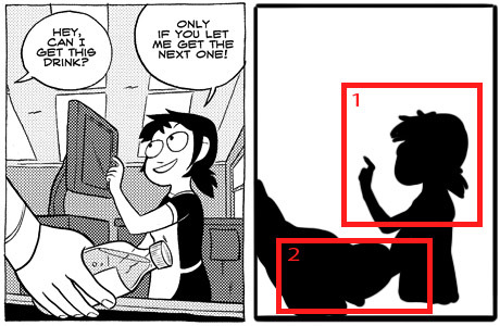
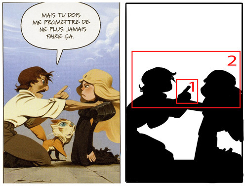
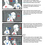
Essentially, the general rule is if you were to fill in your characters and objects with black, you should still be able to tell what they’re doing. All the most essential elements need to be far enough away from the “body” or primary silhouette so that they are distinguishable. The less important elements don’t need to be isolated this way. In the above image, the only two significant things we need to know is that 1) Kim is talking with Ron and Vonnie, and 2) that she is gesturing in an explanatory way and then retreating her gesture. Simple as that.
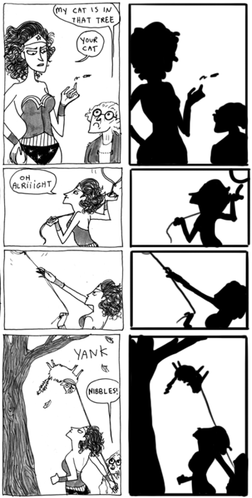
Readable gestures can make or break a scene. Compare Kate Beaton’s clear posing with Wonder Woman in these panels:
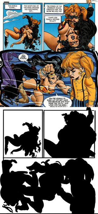
To this decidedly less readable Wonder Woman page:
If what’s going on isn’t clear at the fundamental level, the details can’t save it. This isn’t, of course, to say that you can’t have a complex image that’s also readable. It just requires a lot more skill and attention:
All the essential elements are here above. The lines of action, the relevant silhouette intersections and the overall clarity of what’s happening.
As I’ve mentioned before, when blocking out a scene, it’s useful to identify a hierarchy of visual importance. In general, an isolated silhouette element has a higher visual importance than one that’s intersected with something else. By keeping the essentials clearly defined in silhouette and less important elements intersected or obscured in silhouette, you’ll more easily maintain clarity and effectively draw the reader’s eye to what’s most relevant in a scene. (I should note that when I say “importance” I mean the order in which things are viewed, not necessarily what’s literally most important in a scene.)
While silhouettes alone don’t determine all the essential information of a scene, they are more often than not the foundation. If the most important elements can’t be readable in a simplified form, it means the foundation needs to be reworked. This applies not only to panels and scenes, but to the designs of the characters and environments themselves.
If you can’t easily distinguish your characters by silhouette alone, they should be reworked. Silhouette recognition is a vital part of design, so vital in fact that I’m going to save it for my next post about character and costume designs!
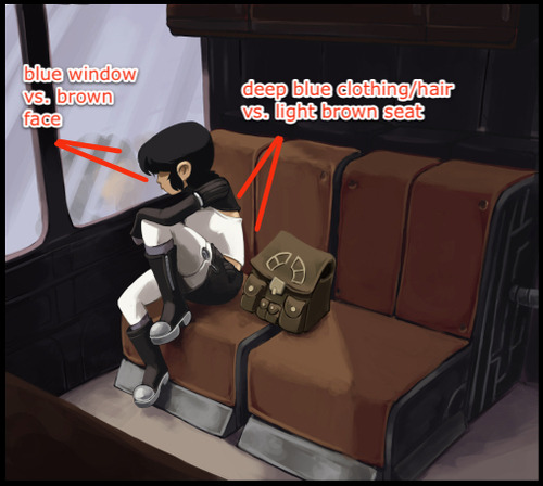
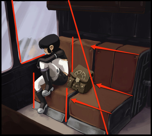
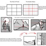
In painting and general illustration, there are some basics everyone should know about composition. Chief amongst these is the importance of a focal point. A focal point is the primary focus of a picture, whether it’s a person, object or simply an abstract portion of the image. Humans have binocular, mammalian vision and our action of “looking” instinctively relies on focusing, not just seeing. Unless we’re looking at a magic eye 3D image, our eyes are only really comfortable with an image that has a clear focal point. Once that’s clear, we allow our eyes to wander and take in the other details.
Achieving a solid focal point isn’t terribly difficult. A few tools that will help are contrast (overall the most indispensable):
Complementary Colors (a subset of contrast):
And overall structure:
However, these are the conventions of painting and illustration, which have somewhat different goals from comics. Comics, even in a single panel, employ the art of the visual narrative, which means there are unique demands for guiding the reader’s eye. Having a single focal point can be enough for some panels or images, but oftentimes it’s necessary for comics to employ multiple focal points in a single image to not only draw the eye in a meaningful, sequential fashion but also to heighten the reader’s excitement and immersion in the story.
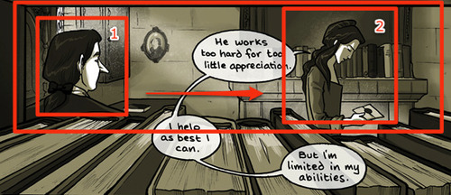
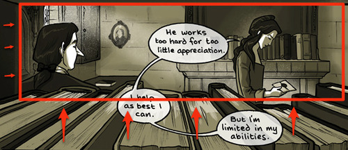
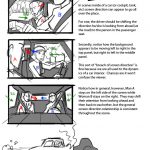
“Sequential art” doesn’t just refer to a sequence of panels, individual images also lead the eye in a sequential manner. There is a hierarchy of focal points that guide the reader through the visual narrative. In the above panel from Family Man, we see the above “focal point” tools being used to create a nice frame, but from there the composition is divided further, first focusing on the man, and then to the woman. A clear hierarchy within the visual sequence is established with some more advanced techniques.
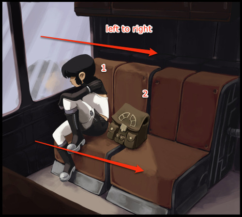
Gazes moving from left to right:
In Western comics, panels and text are read from left to right, so it’s in the best interest of the artist to take advantage of this natural habit of the reader’s eye. Unless forced to do otherwise, the reader is going to look at the top left corner of a comic image and move to the right. A reader will also instinctively look in the direction a character is looking, and in this panel the artist is taking advantage of both of these habits. We start on the man, who is looking at the woman, upon whom we then focus.
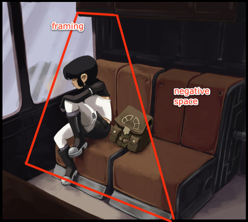
Framing:
There’s a frame created by the books and bookshelf that keeps the eye from drifting downward. This reinforces the previous technique of moving the eye from left to right. (Notice too the slight dip in books near the woman’s hand, drawing the eye to a third and softer focal point, ie: the letter).
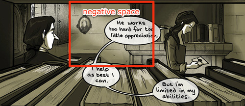
Soft division through negative space:
What largely separates the two focal points is a low detail negative space, where the contrast is low and the eye doesn’t linger. It also creates a 3D triangle of sorts: if we were shooting lasers out of our eyes, they would start at the man, ricochet off the wall and hit the woman.
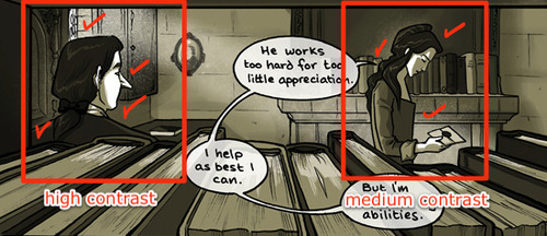
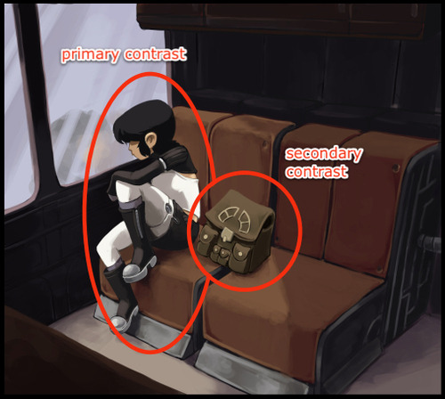
Primary and secondary contrast levels:
It’s subtle, but the values surrounding the man are more contrasted than the woman. This largely serves to reinforce the tools previously mentioned.
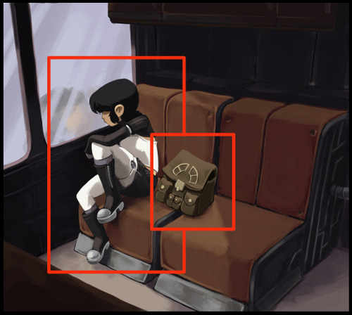
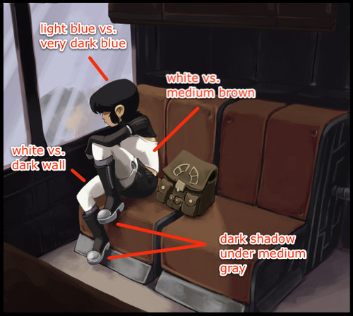
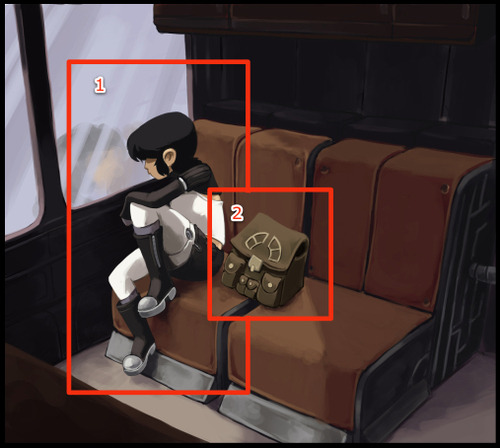
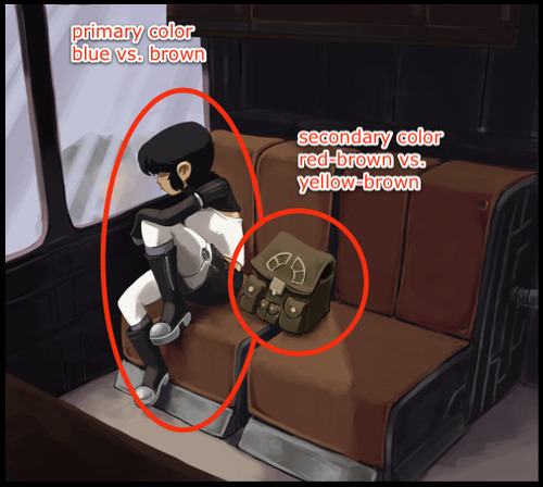
These types of techniques are also prevalent in the first image I showed, with Kimiko being the primary focus and her bag the secondary focus:
As you can see, the tools needed are slightly different, partially because of the larger colors used and other compositional requirements (for example, the image with Kimiko has a more complicated frame because it uses a 3-point perspective instead of 1). The point to take home is that there’s no one way to make this work; you may use some of these tools and not others, depending on what the image requires. Additionally, it should be noted we’re not limited to two focal points. Depending on the comic, there could be more. It all depends on what the visual narrative requires.
This is the key: no matter what the style, comics are a visual narrative. If we establish a clear sequence of visual relevance, the reader’s eye is active and their mind is engaged. Pull them into your world and keep them for a while.
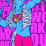


[Images: Artwork of Korra, Tenzin, and Amon crossed with LMFAO imagery. Colorfully.]
Oh, I’m sorry, you must have mistaken me for someone who makes good and thoughtful artistic decisions.
KorraxLMFAO prints for AM2con/AX/Otakon
Why? Why these characters? Why why why? I just. I just can’t say.
First I was like
Then I was like