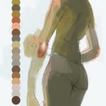
handy dandy face lighting references
Tag: tips
Untitled
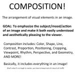
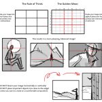
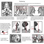
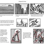
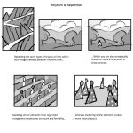
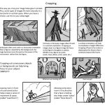
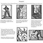
Today I gave my students a quick presentation on some of the basic considerations for composition, which I am now sharing with you! I’ve given them separate talks about color and tonal value/contrast, which are also super important compositional concerns. (I’ll be sharing those presentations too once I properly format them)
I personally love learning about different compositional techniques. It’s fun to think about the ways that the brain views & sorts images, and how we can trick it into feeling a certain way or looking at certain aspects of an image first! It’s easy to fall into compositional ruts (which I am also guilty of) because a lot of art gets by with mediocre, though serviceable, compositions. If you can generally understand what’s happening in an image then it’s generally fine. However, it’s the truly great compositions, where everything in the whole image has been considered and ‘clicks’ together, that bump up an illustration to a visual slam dunk. NC Wyeth is one of my favorite artists for this reason: his compositions are rock solid, varied based on the image’s intent, and always enhance the mood or action he is depicting.
For extra reading, some online compositional resources that I’ve found helpful or interesting include:
Creative Illustration by Andrew Loomis (download it for FREE. Such a great book all-around.)
Gurney Journey (check out the “Composition” tag, but really everything he posts is great)
The Schweitzer guide to spotting tangents
Cinemosaic (a blog by Lou Romano with some truly WONDERFUL compositions captured from various films)
Where to Put the Cow by Anita GriffinHappy composition-ing!
A solid breakdown of the fundamentals of composition, complete with examples!
Untitled
(tutorial)
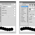
i just did a cool thing that i think would be useful if you’re like me and sometimes have a hard time picking colours / a colour scheme for an image
basically i just took a brush with moderate spacing, turned on colour dynamics and set all the hue/sat/brightness to a low (~10%-30%) jitter, picked a base colour, and drew a line down the side of the canvas
it’s sort of like when some people save colour swatches so they can keep their shading consistent, but more for playing around with different tones and lighting on a single surface. it’ll probably be pretty good for skin which is very multi-tonal by nature.
a lot of colours came out that i probably wouldn’t have picked manually, but they still looked pretty cool. and it saves a lot of time because now i have a broad range of colours without having to browse through my pantone swatches or open up the colour picker.
Untitled
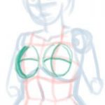
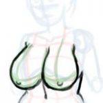
The photoset wasn’t working the way I wanted, so here’s the original “base” by itself:
The red lines are meant to mark the contours of the body.
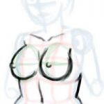
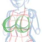
Once again, a very quick guide as tips for drawing breasts. As before, this is a bit rushed and just a starting point for drawing breasts in different sizes with attention to the shape, nipple position as it relates to/and sag.
Not an authority, just doing this since people have asked nicely for a long time. May do a better one in the future.
Untitled
Blue Reflected Light by =toerning
A simple explanation of reflected light. I’m going to try this soon.
Untitled
I WAS REQUESTED TO DO THIS
UH
Here’s how to draw beer bellies and chubbier dudes!
I hope this is helpful to someone. Thanks to Mammon for helping me fix some errors!
Here is a full-size version in case tumblr eats it.(i should stop making tutorials i’m not even good enough for that…)
reblogging for contemplatingchicken
why thank you! one of my (many) ambitions is to do art with a variety of body shapes in it.
(Hum somehow this reminds me that at some point I think I might buy the Fat Ladies in Spaaaaaaace coloring book.)
This is cool!
Untitled
Untitled
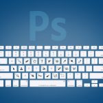
I could have used the indesign shortcuts during my 2 years in yearbook…
In Photoshop, you can also use the spacebar for the hand tool! I find this a lot faster than the “H” key.
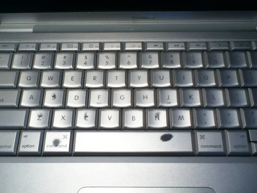
Actually, you can see which shortcuts I use most just by glancing at my keyboard (Especially the spacebar and command keys, because I always tap them with my thumbnails)


