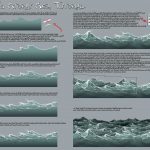
Stormy Sea Tutorial by suzidragonlady
Drawing water is one of the most intimidating things for me, I’ll be needing this tutorial soon!
Stormy Sea Tutorial by suzidragonlady
Drawing water is one of the most intimidating things for me, I’ll be needing this tutorial soon!
Sorry I took so long to answer this! I hope it helps. Here it is larger if the tumblr formatted version is hard to read. I found this other tutorial that might help you, also. There is a frustrating dearth of tutorials on this subject. Good luck!
I DIDN’T REALIZE HOW MUCH I WANTED THIS TUTORIAL TILL I CAME ACROSS IT THANK YOU SO MUCH!!!!
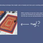


a new technique I found while working on my latest comic page. Thought I’d share the process!
I’m not sure if this is a really obvious tip, but I can’t believe I didn’t think of doing this earlier.
All those concrete walls I painted in perspective ;-; They could have been painted in 2d! Hope this is helpful to someone. I’m pretty excited to use this in future environment paintings
Learned this at work recently. Really useful technique. :)
I tried this out in a couple places on the page I’m working on and it’s SO HELPFUL!
Came across this library of digital painting resources this morning.
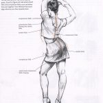
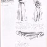
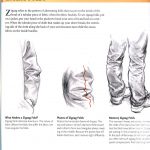
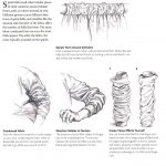
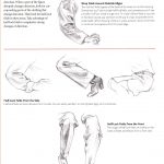
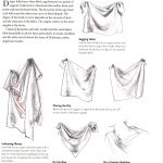
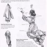
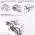
How to draw folds
Notes on how to draw folds back when I was teaching manga classes back in 2006. From the book “Drawing people” by Barbara Bradley.
http://www.amazon.com/Drawing-People-Portray-Clothed-Figure/dp/1581803591
This book has a very detailed description of 6 types of commonly seen folds and I think is one of the most educational resource on how to draw folds(Besides Vilppu and Bridgeman).
這是我以前教漫畫課程時給學生看的講義.來源是芭芭拉布莱德丽的”着装人物素描”«上海人民美术出版社出版».
書裡講解了皺摺形成的兩個主要原理(拉扯與擠壓)以及因兩種作用力下形成的六種常見的皺褶類型.
Hello there potentially helpful art thing.
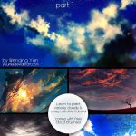
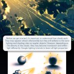
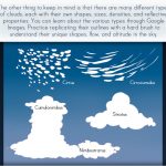
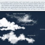

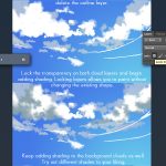
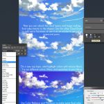


The first part of the cloud tutorial is finally here :D You can view the full version on my dA. Part 2 will be posted after I get back from SacAnime.
Here’s the free download to the Photoshop brushes.
I hope this will be helpful to you guys! Have fun painting!
_____________
–Full view of sample cloud paintings
–Gif of the tutorial work progress (best viewd in Firefox)
Hey! Are you a freelance writer or artist? Do you wish there was a manual so you know what to do and what not to do when either commissioning work or being commissioned?
In the parlance – LOL NOPE!
But, don’t lose heart, true believer. Here are a few things I’ve picked up along the way as a professional writer. Bear in mind that, as such, these words of pseudo-wisdom are going to come from the perspective of a writer who commissions artists to draw his comics, but there are (I hope) lessons to be learned for artists, too.
RULE ONE – Do not, under ANY circumstance, request free art. That is the most rookie of rookie mistakes. So don’t do it, rookie! Also, if you’re an artist, don’t agree to do work for free. You will regret it and you will resent the person who asked.
RULE TWO – When commissioning an artist, be brief but specific in your introductory email. Give them an idea of what you’re looking for (number of panels/pages, pencils, inks, color, et cetera). Also mention if this is a commission for personal use (you want to hang it up on your wall and marvel at its beauty) or business (you want to post it to your site, include it in a book, sell it as a print, et cetera).
Do NOT send your script right away. If you read as pushy, the artist may be disinclined to work with you. Give them the gist and, if they’re interested, they’ll write back and you can go from there.
SIDEBAR FOR ARTISTS – Somewhere between working for peanuts and getting paid what you are actually worth lies the path to treating your art like a business.
RULE THREE – When there is interest from both sides to engage in a commission, there must be a mutual respect when it comes to TIME and MONEY. Writers: Believe it or not, it is MUCH EASIER for you to write a thing than it is for an artist to draw it. ARTISTS: Be honest with yourself about a script. Can you do it? More over, do you have enough interest in the writing to do the job well?
RULE FOUR – When it comes to the price of a commission, don’t be a dick about it. ARTISTS: take time, resources needed, and interest into account when coming up with a price. Know, right from the start whether your commission rate is an opening gambit or something set in stone. WRITERS: When formulating a price ceiling in your mind, take into account how you intend to financially benefit from the work you are purchasing. Also, consider how strongly you feel this artist is the correct fit for your comic.
BEFORE WE TALK ABOUT WHAT HAPPENS IF A PRICE IS AGREED UPON – If a price CANNOT be agreed upon, again: DON’T BE A DICK ABOUT IT. This goes for both writers and artists. Sometimes shit just isn’t meant to be. That’s okay. There will be other opportunities. If you’ve been polite and professional, there is no need to beat yourself (or anyone else) up over a deal that didn’t work it. It happens ALL THE TIME.
RULE FIVE: If a commission is agreed upon, make sure to keep lines of communication open. WRITERS: This does NOT mean emailing your artist every damned day. You are not in a monogamous relationship. Your artist is either working on other commissions, too, or they have a day job. If you don’t hear something for over a week, check in, just don’t demand a timeline. ARTISTS: Let your writers know what’s up. Setting an approximate deadline will do you both good. Send sketches along so that your writer can see what you’re cooking up and give notes. Notes based on sketches grant a much stronger likelihood both parties will be satisfied with the end product.
RULE SIX: Be clear about what can happen once the work is complete. If this is to be commercialized art, there needs to be a defined sense of what each party can do with that art. If it’s being sold in any format, will will the profits be split? If it’s posted online and there’s ad revenue, will that money be split? These things absolutely MUST be decided upon before the work is done.
RULE SEVEN: No matter what transpires during the creation of art, keep that business private. If the writer and the artist struggle with one another, they will both look bad if one of them has a big mouth and complains about it to anyone who will listen. If someone specifically asks you about a collaboration – that’s different. But still: DON’T be a dick about it. If there was a conflict, explain it in terms of work flow, not two egos butting heads.
And that’s it. If I missed something or if you disagree, jump on in and elaborate. It’s always good for writers and artists to help one another create good work.
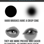
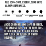
Little nugget of advice that really changed the way I approached painting. When I started blending like this it was a real turning point for my art quality.
Forgot to add that lighting conditions and other variables in a piece make the hardness you want to choose somewhat variable. Drawing things like skin is more of a hardness range than it is a hard rule.
Eheh…get it? Hard rule? (aaaaaaaaaand i’m done).
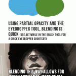
Haa thanks, I can’t even put into words how unappealing the overuse of a soft brush is when rendering. There have even been otherwise expertly painted images that were (in my opinion) ruined by that overly soft ‘airbrush’-y look that soft edged brushes give off.
I mean, I just really hate soft edged brush in most cases. It’s definitely the fact that you can’t read any real confidence in the brush strokes of a soft edged brush. It makes it really difficult to nail down any solid shapes or forms in your painting. Weak vagueness both in brush strokes and with shape and form is generally not a good thing when painting.
If I can tell a soft edge brush was used (a lot) in an image, I probably won’t like how it’s been applied.
Seconded, started doing this awhile ago, really is nice.
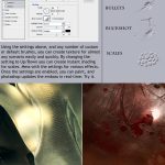
ooooh~ Photoshop I need to remember how to use you~ <3
How on earth did this never occur to me. I mean, I’ve used it for texture in some ways but not in these.
One of those “WHY DIDN’T I EVER THINK OF THAT?!” moments.
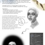
bisexual candycorn: thoughts on skintones
people ask me a lot about drawing poc, more specifically “how” to do it. my kneejerk reaction is to get frustrated by it, because the answer is “just like you’d draw anything else.” it’s like the main excuse artists and writers use to not include poc in their art and in their worlds — they “don’t know how,” implying that we somehow operate by a separate set of rules, that while white characters don’t require a special set of considerations to be varied and textured and interesting, non-white characters are just an elusive series of step-by-step instructions that most creators just can’t be assed to learn or to include
i still feel that way
but
i guess i can understand that most instructive media focuses specifically on white aesthetics, proportions, skintones, and features, so there really is a need for more instructive material that is more inclusive
i can dig it
that said, there is a lot that i don’t know and am not good at and i don’t really feel comfortable trying to instruct other artists, but i’m fine with taking you through my thought processes a little
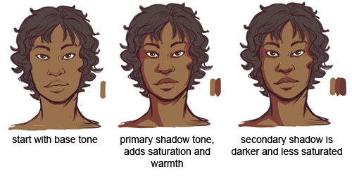
SO here’s some stuff about skintones. it’s not perfect, and there will never be a better teacher than the world around you for showing you what things look like and how to express them
first off, if you’ve ever seen me stream you know i don’t usually block in my shading with hard lines like this. i like to paint and sample colors as i go, but i’m trying to communicate my ideas about color a little better
but i’ve always used the same basic process for coloring skintones, any skintones, forever and always:
this is going to change up a little bit with directional lighting, colored lighting, environmental lighting, shit like that, but this is your basic procedure. the biggest mistake i think artists make is using skintone+black for shadows and skintone + white for highlights, and that results in pretty dull looking skintones
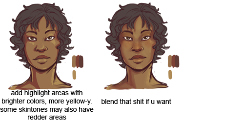
in the former image, i only varied the value of the main skin color, but in the latter i also varied the hue and saturation. doing so gives you more of an opportunity to add warmth and depth to your colors, as well as bring in environmental colors if you need to
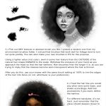
you want to sample around the palette, use reds and purples and oranges, don’t just stay within the range of your base tone!
this applies for all colors, not just skin, but especially skin! you want skin to look alive, not plastic and dull
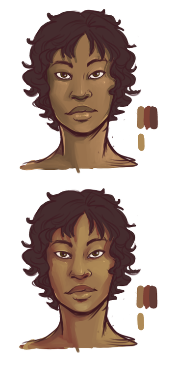
these same rules apply for most skintones
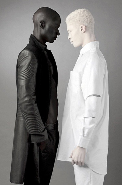
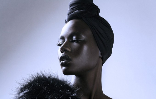
though it’s always going to be incredibly helpful to just look at references of the skintone you’re trying to draw, for little details like (for example), very dark skin, because there is a more extreme light/dark variation, will often look much more reflective than very light skin under the same lighting conditions
like so
because of this, you’ll want to work on using light more than shadow to describe form on dark skin
again, this is true of all colors, but especially skin, because you don’t want skin to look flat and lifeless!
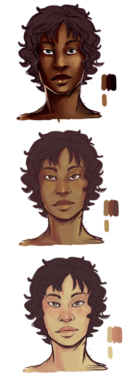
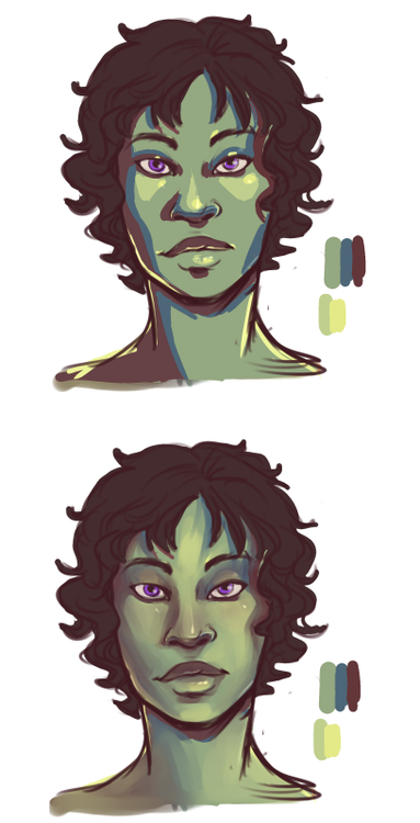
the same rules can apply to fantasy skin tones. start with a base tone, then use warm, saturated colors to add light and shadow. sampling around the palette becomes really important for fantasy skintones if you are trying to make them look realistic/believable
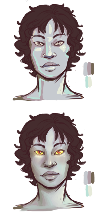
this is especially true if, for whatever reason, you wanted to make a character with grey skin that looks alive and believable
OKAY THAT’S THE END OF OUR SHOW
LOOK AT THIS GOOD ASS RESOURCE MOTHERFUCKERS
Another helpful note is that darker skin tends to be shinier, which is especially easy to see on the super-dark people in the pics above. My rule of thumb is to use larger swaths of highlights on light skin, and more focused, smaller ones on darker skin.
(Though this is no more a hard-and-fast rule than anything else in art, but it’s a decent shortcut.)
Sharing another drawing tutorial for any interested. :)