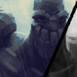
I HAD TO HAVE THEM (studiocult.co)
I HAD TO HAVE THEM (studiocult.co)


Dan Fessler’s HD Index Painting Technique let’s you paint pixel art in Photoshop in a non-destructive manner, and lets you use pretty much every tool in a perfectly pixel-gradient fashion!
The article gives you everything you need to try it out for yourself.It’s easy to set up and use, and the results are so fucking cool.

Took a bunch of pictures of my AB table and tried using Photoshop’s photomerge tool to make a panorama.
GO HOME PHOTOSHOP YOU ARE DRUNK.
Here’s the good one, btdubs:

SO.
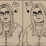
I’ve been doing more inking practice lately, in preparation for changing the visual style of The Hues to incorporate inked linework. Not a decision I came to lightly, but it’s going to help me work a lot faster, and inking is a skill I need to work on more, so here we are.
I bought Manga Studio 4 on sale awhile back, but I’ve been too intimidated to spend more than about a half hour at a time in there. I decided to Really For Real ink something, so I started with this drawing of Lauren. I started inking in MS, but wasn’t sure how I felt about how it was looking, so I went back to PS and inked it the way I usually do.
Theeeeeeennn I was getting ready to start arting earlier today and was about to start inking my comic when I decided to warm up by finishing the inks on Lauren in MS first. I finished her up, and compared the two inking jobs, which kind of settled my decision.
Now, I think the Photoshop inking looks just fine. The pressure sensitivity is a little lower, so the lines are a bit bolder, which is fine, but when I look at the MS inks, I think they just look a bit more nuanced and interesting. So I decided I’ll be inking in Manga Studio for the foreseeable future.
Now that I’ve worked in MS for a couple hours, I’m a lot more comfortable with the tools, and I really love how the pen tool handles and responds to the pressure sensitivity.
It has been an interesting day.

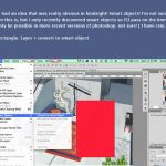
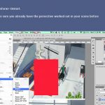

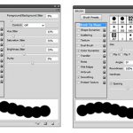
a new technique I found while working on my latest comic page. Thought I’d share the process!
I’m not sure if this is a really obvious tip, but I can’t believe I didn’t think of doing this earlier.
All those concrete walls I painted in perspective ;-; They could have been painted in 2d! Hope this is helpful to someone. I’m pretty excited to use this in future environment paintings
Learned this at work recently. Really useful technique. :)
I tried this out in a couple places on the page I’m working on and it’s SO HELPFUL!
ooooh~ Photoshop I need to remember how to use you~ <3
How on earth did this never occur to me. I mean, I’ve used it for texture in some ways but not in these.
One of those “WHY DIDN’T I EVER THINK OF THAT?!” moments.
Let’s Draw The Hues! Page 46 Pencils & Lettering [3 of 7]
Let’s Draw The Hues! Page 33 Shading

(tutorial)
i just did a cool thing that i think would be useful if you’re like me and sometimes have a hard time picking colours / a colour scheme for an image
basically i just took a brush with moderate spacing, turned on colour dynamics and set all the hue/sat/brightness to a low (~10%-30%) jitter, picked a base colour, and drew a line down the side of the canvas
it’s sort of like when some people save colour swatches so they can keep their shading consistent, but more for playing around with different tones and lighting on a single surface. it’ll probably be pretty good for skin which is very multi-tonal by nature.
a lot of colours came out that i probably wouldn’t have picked manually, but they still looked pretty cool. and it saves a lot of time because now i have a broad range of colours without having to browse through my pantone swatches or open up the colour picker.