Tag: comics
Untitled
The eBook edition of Part 4 is now available for purchase. :)
Volume I Release Schedule:
- Part 1: February 13th
- Part 2: February 27th
- Part 3: March 13th
- Part 4: March 27th
- Part 5: April 10th
- Part 6: April 24th
- Volume I: May 8th
How a Dresden Codak Page is Made
It starts with a rough outline. For Dark Science I have a basic script and story outline, and I decided how much of that script can/should fit onto a standard page. From there I start working out what I needed to draw.
Concept Sketching
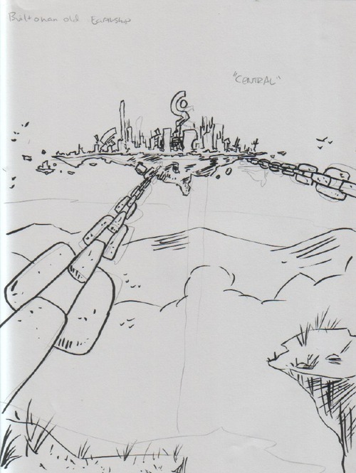
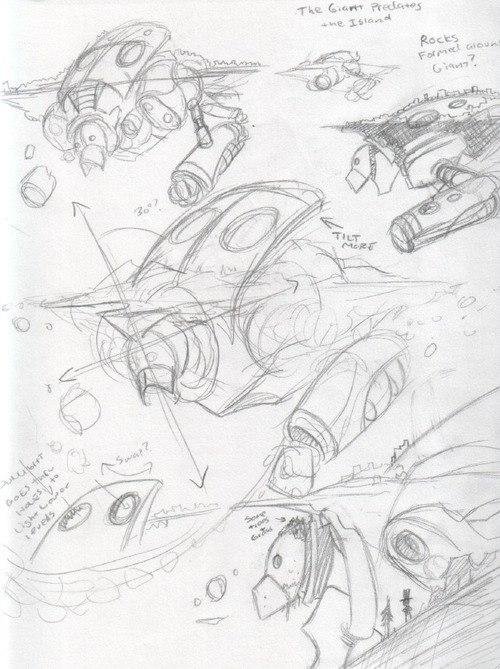
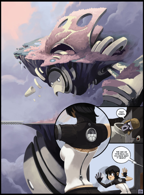
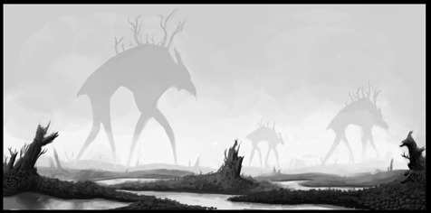
With this page I started with sketching Nephilopolis. Having written the story ahead of time, I already had a rough idea of what I wanted, but not the details. I started by going back to my first sketch of the island I did months ago (before I’d finished the plot).
A very rough idea at this point. Once I got to this page in the story and actually solidified the notes about the setting, I began fleshing it out:
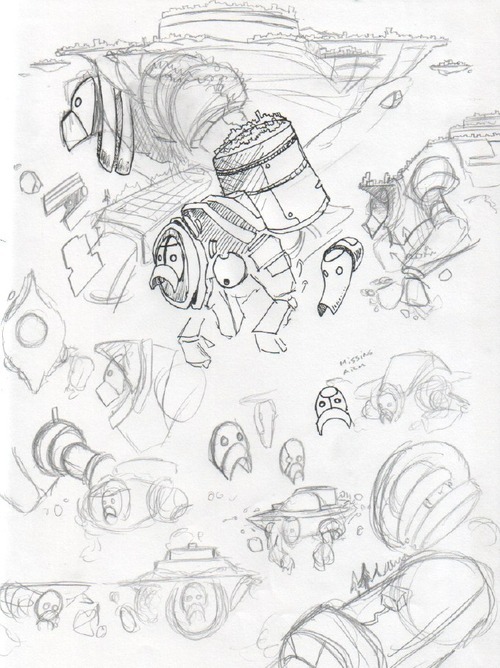
Here I’m just sketching out possible elements. I wanted to make the head clearly recognizable, and also for the giant’s shapes to contrast clearly with the shapes of the island. At this stage the design was still fairly symmetrical. After I was comfortable with the basic idea, I set the giant at an angle to the island and worked on more details:
Although at this point the design wasn’t “finished,” but it was enough to get started on thumbnailing the comic:
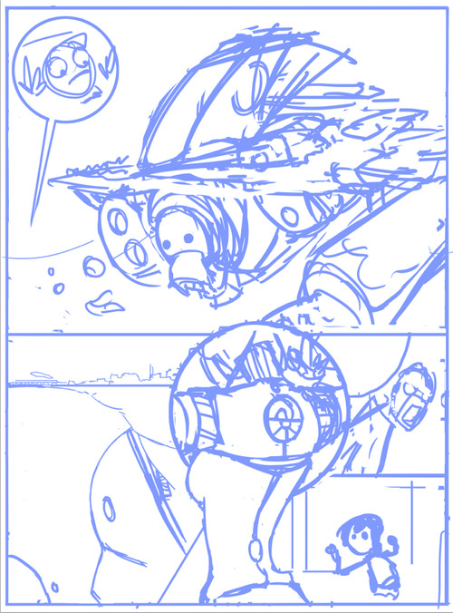
Thumbnail
Using a standard hard round brush in Photoshop, I quickly and roughly start working on the basic layout of the page. From the “script” I have directions as to what needs to happen in the scene, but I don’t worry about the specifics of the dialog until later, as it will depend on how the images end up shaping.
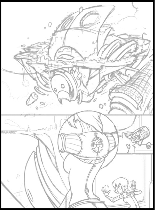
Pencils
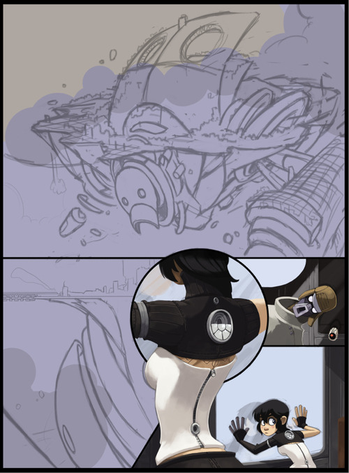
Using a textured brush that looks a bit like pencil (there’s no need for this, just a personal preference), I start “pencilling” the page, solidifying the forms and rendering all the details that I don’t want to forget about when I start to color. With the Nephilopolis island I left things rougher, as I know from experience with landscapes that I end up improvising a lot when I start painting. By contrast, Kimiko and the stranger are tightly rendered, as they’ve already been fully designed and introduced in previous pages.
Painting
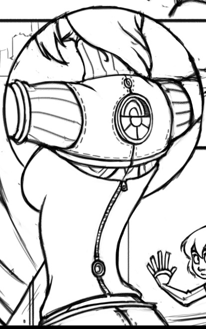
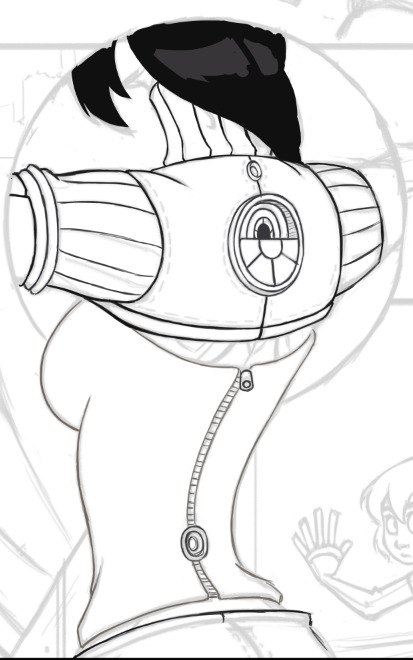
I’ll use a specific section to illustrate the steps I normally take with painting.
Step 1: Colored Lines
Using a round hard brush with pressure sensitivity controlling both opacity and size, I draw out the basic outlines. Even though often these outlines won’t be visible, it’s a good starting point for blocking in colors for the next step and ensuring the edges of the figure are smooth. I only generally use this step for figures, as I tend to give them sharper edges so they’ll pop out a bit.
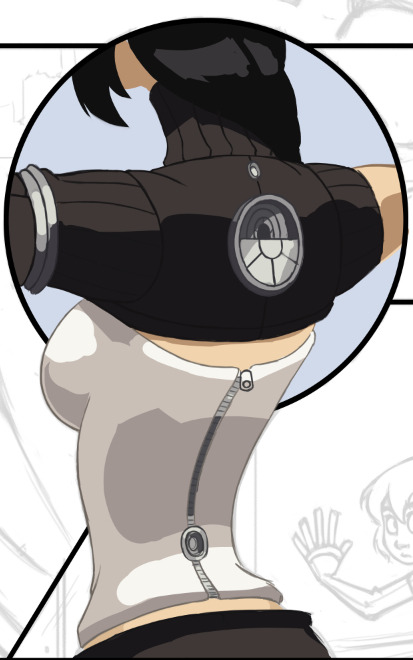
Step 2: Blocking in Colors
Underneath the lines layer I start filling in the basic colors. I’m not concerned with detailed shadows and lighting just yet, only making sure the general colors are where they need to be. At this point I’m working with four layers: one set of lines & colors that go underneath the black borders (the top half) and one set that go on top of the borders (bottom half).
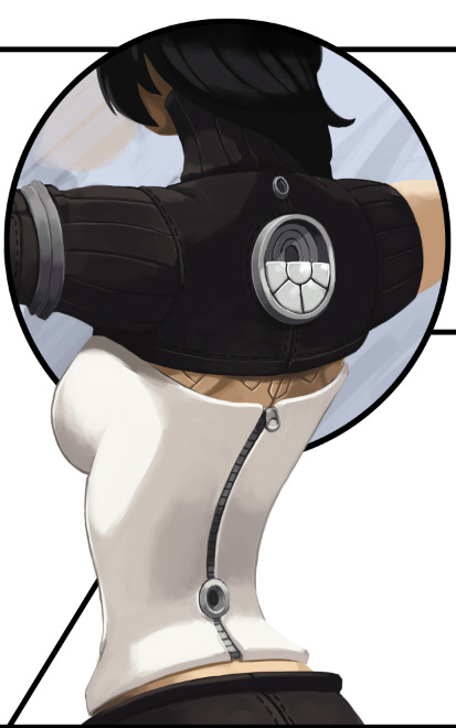
Step 3: Flatten and Render
From here I flatten the color layers with their respective line layers and, with a round brush set to opacity sensitivity (no size sensitivity), I begin painting. As you can see, some of the lines I’ve left and some I’ve removed; it all depends on what’s needed. Also note that this actually looks slightly different from the “finished” torso in the comic, as I went back a couple times and tweaked some details. No piece of the comic is totally finished until everything is finished.
Rendering the Island
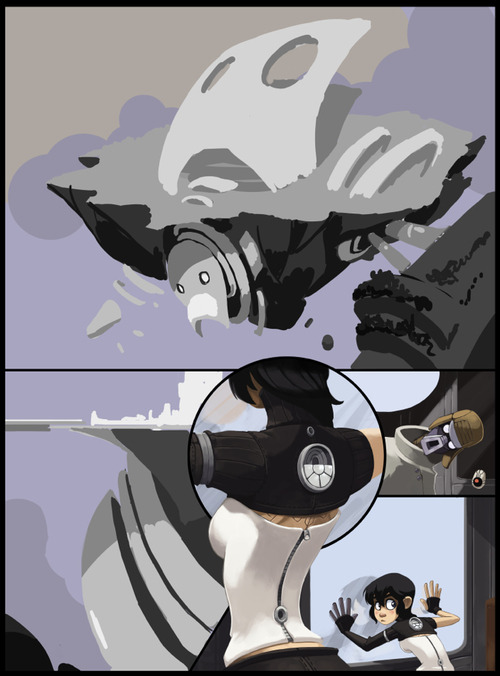
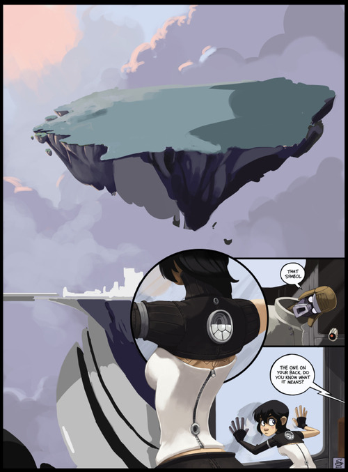
With this page I started with the “known” elements (Kimiko, the stranger and the train car all had set designs and shapes) and worked my way to the “unknown” (the island). I dropped in a basic filler for the sky and started to think about the tonal values.
Setting up Tones
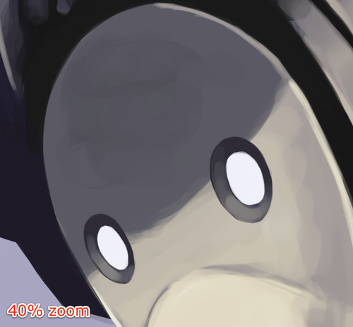
For a very complex image that you haven’t painted before, it’s easy to jump into it with lots of colors, guns blazing, but you run the risk of losing appropriate contrast and overworking key areas. For these situations I prefer to make a grayscale “underpainting,” where I work out the appropriate tones. I don’t allow myself to blend anything or use colors at this point. Once I’m satisfied with the basic lighting, I move on to color selection.
Here I’ve begun testing colors. I decided at this point to remove some of the border lines. I found them to be distracting as I started to have a better view of the composition. I’ve also moved the robot portions to their own layer and hidden it for the time being, letting me focus on color selection and rendering of the rock and island portions.
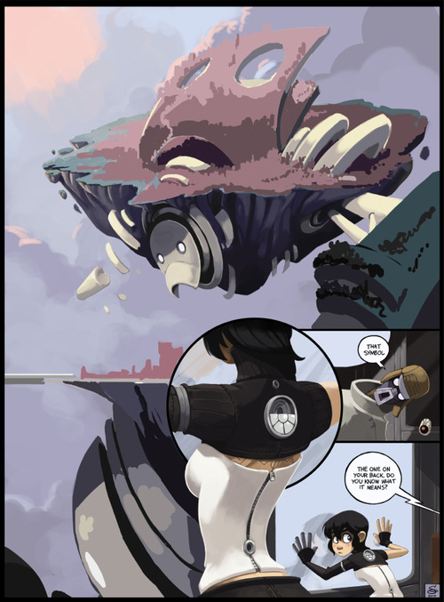
Rendering the robot portions begins, leaving the details of the top portion sparse for now, as it will be mostly covered by the city portion.
Toying around with the colors of the cityscape. Not concerned with details yet.
Most of the city is rendered at this point. I’m leaving the robot’s arm until later, as I’m not satisfied with how it’s playing against the rest of the picture.
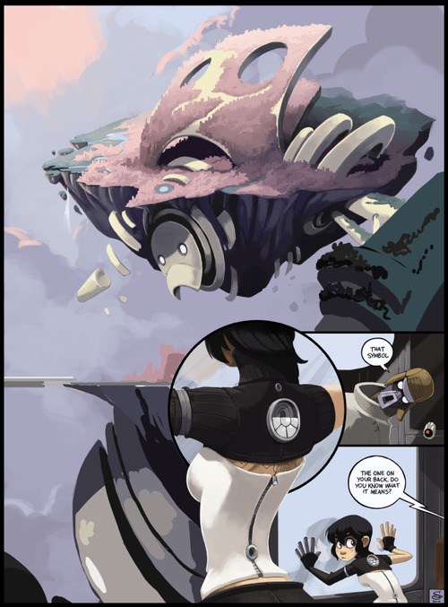
Nearing completion. Fleshed out the clouds and added some contrast. Still toying with the arm.
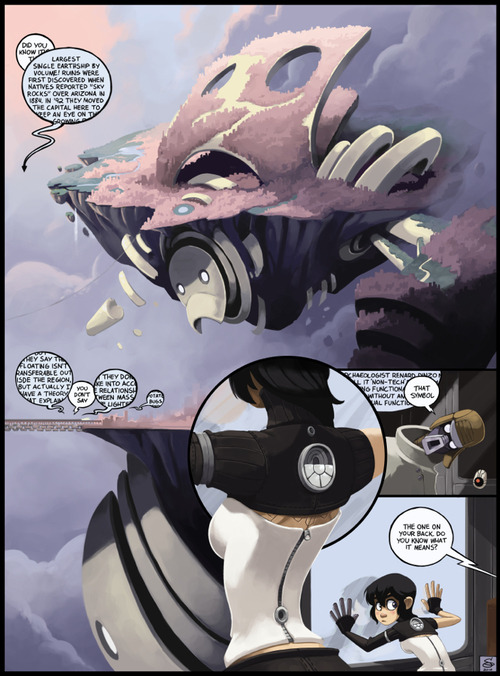
Finished up the arm, and added the final text bubbles. Done!
5 Essential Superhero Redesigns!
Seeing as how I’ve done both the top ten for best and worst superhero costume redesigns, I feel obligated to put my money where my artistic mouth is and take a stab at fixing or updating some of these costumes. I’ll be taking a similar approach to my earlier take on Batman & Robin, where both the back story and design of each character are fair game. I’ve done five here, and chose them based on one of two criteria:
- It’s a particularly awful outfit that doesn’t fit the character, or
- It’s a solid character who just needs some updating or tweaking
I’ll list these in order of “reboot depth:”
5. Starfire
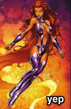
What’s wrong: In the wake of DC’s “new 52” this felt like a no-brainer. Starfire is a decent character who’s always, in my opinion, gotten the short end of the costume stick. I get that she’s supposed to be sexually liberated and somewhat polyamorous, and that’s fine, but dressing like a John Carter’s Princess of Mars-themed stripper doesn’t cut it. Really, up until the Teen Titans cartoon she’s always been in the most awkward and impractical getups for someone fighting crime.
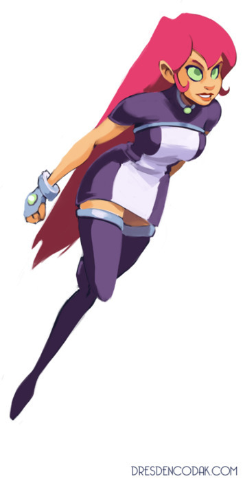
The Fix: I went for the simple route and took some notes from the cartoon (notably the skirt). I wanted to make sure it kept the bubbly, innocent feeling of the character while also hinting at some power (with the exposed arms here). The overall effect is meant to convey someone who’s tough, cheerful and comfortable flying around in the air.
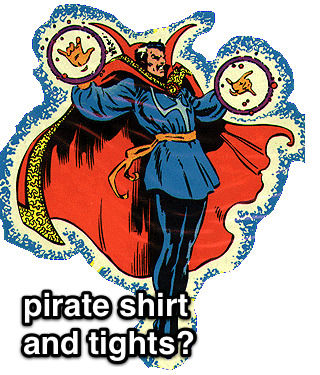
4. Dr. Strange
What’s wrong: I love Dr. Strange, but he’s always had the worst outfits. For a guy who basically hangs out in his house in the West Village, he seems to always wear the most ostentatious getups. He’s not an alien from another planet or from some culture that would dress that way, he’s a grown man who became a wizard well into adulthood. Nothing wrong with having some style while you’re maintaining the balance of the mystic planes.
The Fix: Two parts Vincent Price, one part Christopher Lee and one part Dr. Orpheus, this Dr. Strange is still magical, but with a more coherent design direction.
3. Ms. Marvel
What’s Wrong: Simply put, I think it’s embarrassing for Marvel to showcase a prominent character like Ms. Marvel and have her wearing that outfit. It’s just so tacky, and tells us nothing about the character. Basically they just changed the colors of Jean Grey’s Phoenix costume and exposed more skin. Come on, guys.
The Fix: Since her origins are ostensibly tied with Captain Marvel, I decided to go a route that’s more along the lines of the Ultimate Marvel version of that character, where her abilities come from alien technology rather than vague space magic. The notion that she’s, for example, permanently bound with this technology that she doesn’t fully understand can make for some interesting stories. There can be some potential with this character again with just a little bit of tweaking.
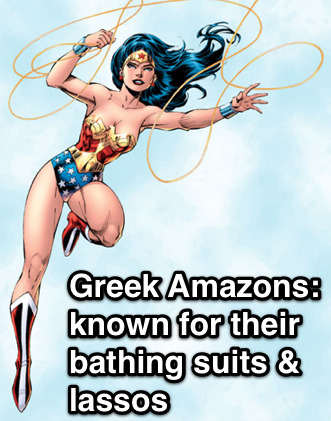
2. Wonder Woman
What’s Wrong: Wonder Woman, in my opinion, is a character that’s always been on the cusp of being really neat but never quite making it like Superman or Batman. Although a feminist pop icon, her origins are too tied up with creator WIlliam Marston’s obsession with bondage. Because of this (and an all-too-frequent parade of poor or sexist writing), she’s never had a solid, progressive design. The 21st century can update this character.
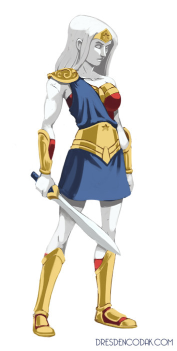
The Fix: One part Thor, three parts Xena. I’d push the mythological angle further. Just as nobody thinks of Thor as “Superman with a hammer” I don’t want Wonder Woman to be “girl Superman,” as she’s sometimes seen. I’ve also tweaked her origin slightly, making her a more literal “statue come to life.” This isn’t as extreme as it seems: in regular canon, Wonder Woman’s origin was that she was formed out of clay by the queen of the Amazons, and imbued with the powers of the Greek Gods. (Note: I am well aware that Greek statues were painted, but for aesthetic & thematic reasons it doesn’t work here. She’s just an old statue, so there wouldn’t be paint.) This, I think offers more story possibilities if she’s less literally human, physically. Her personality would remain the same (nothing more fun than the perspective of an Amazon in the modern world), but we now have an added Greek layer of Pygmalion or Telos.
The costume change is mostly conservative. Because of the strong fetish associations (and overall impracticality for a fighting Amazon), I’ve removed the lasso in favor of more traditional Greek weapons. The overall effect is intended to push Wonder Woman’s core themes further while making her also stand out as more than just “the female superhero.”
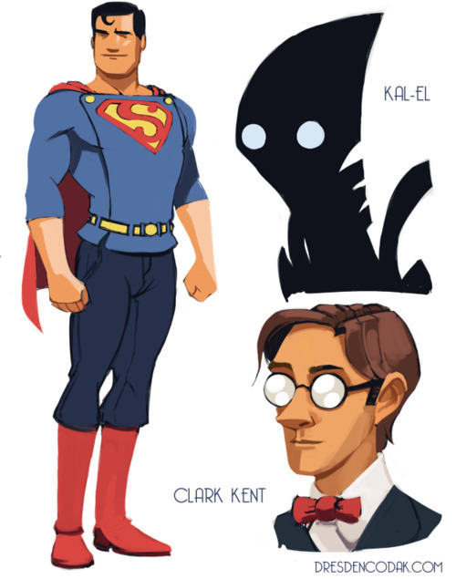
1. Superman
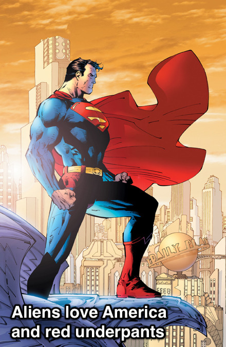
What’s Wrong: Since his creation, Superman’s drifted from being a progressive champion for the common man to a patriotic middle-America boyscout who represents the establishment and traditional values. When he was developed in the 30s, Superman was very much a Depression-era hero, mostly going after villains like crooked money lenders and saving people who were being abused by the system. His superpowers came from the fact that he was from a more advanced society, and his morals too were because he was simply a brainier, more sophisticated guy. During and following WW2 and into the Cold War, though, he became an official symbol for American values in particular (it was originally “Truth and Justice,” without “the American Way”). He was now not just an alien, but an alien raised by simple Kansas farmers and his abilities had a more generic “superpower” explanation. This is all fine, really, but I think the original concept is more compelling these days.
The Fix: Two parts Martian Manhunter and Ten parts Fleischer Superman. “Superman: the Man of Tomorrow, Strange Visitor from Another World.” I really want to push that. First off, Kryptonians should actually look like aliens and not white people. Here I have Kal-El from a race of beings whose technology and biology are long since indistinguishable (Clarke-esque space gods, you know the type). They’re strange to our mortal eyes but mean well. I’d keep the “destroyed planet” origin but more heavily emphasize the “non-interference” part of Superman’s mission statement.
If you’ll remember from the 70s movie, his father Jor-El told him he was forbidden to interfere with the course of human history, but when you think about it, that’s kind of vague. What I’ve done is added a Star Trek or Uatu the Watcher kind of prime directive to all advanced species: Kal-El can’t let people know that he’s an alien, nor can he openly interact with them using advanced technology. Still, he’s a compassionate guy and wants to help, so he takes the form of “Superman” to inspire the mortals in a constructive way. Also, the notion that he can take on different forms means that the Clark Kent secret identity need not be as bad as it currently is.
The costume redesign holds to the basic themes but makes it a little more working class. The buttons at the top are meant to invoke overalls, and the sleeves are cut a little higher for someone working with their hands. I’ve removed the spandex and gone with looser fitting slacks, while keeping a short cape and boots, since he’s still an adventurer.
Overall I want to evoke a classic Superman feel while making it a little more modern in its exploration of the sci fi themes. He’s still basically the same guy: an alien from another world looking to fight injustice, but without the overt patriotism and a quirkier execution of the secret identity.
*********************
So there you have it. I’ve hope you’ve enjoyed my superhero costume trilogy!
Silhouettes: the Silent Killer
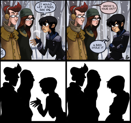
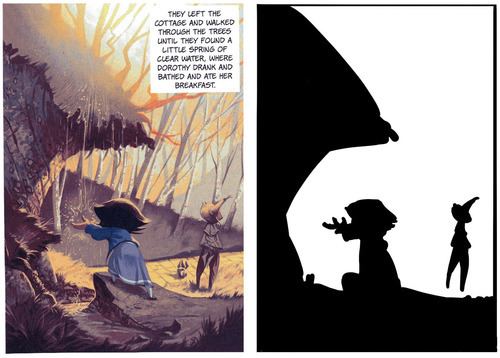
The eye isn’t a camera. When we view objects, especially moving objects, our brains tend to break them down not into a collection of varying hues, but rather silhouettes. Quick object identification is a primal evolutionary necessity, and it’s a foundational way our visual interpretation works. It’s why camouflage works too.
When an object’s silhouette is difficult to make out, we have a tough time keeping track of what we’re seeing. It’s why so many comics and drawings use the visual shorthand out outlining figures and objects. The shades and values of an object are secondary to the basic shape when it comes to recognition. As such, effectively managing silhouettes is a vital tool for visual narratives.
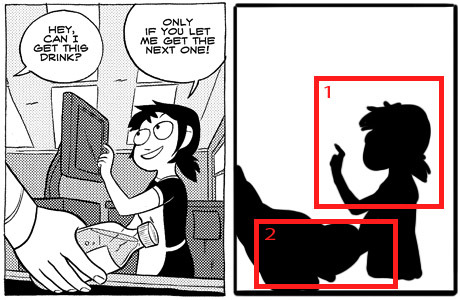
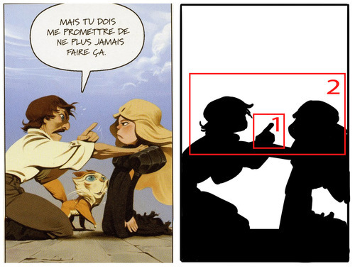
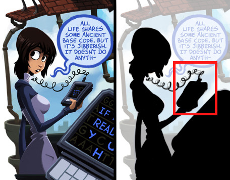
Essentially, the general rule is if you were to fill in your characters and objects with black, you should still be able to tell what they’re doing. All the most essential elements need to be far enough away from the “body” or primary silhouette so that they are distinguishable. The less important elements don’t need to be isolated this way. In the above image, the only two significant things we need to know is that 1) Kim is talking with Ron and Vonnie, and 2) that she is gesturing in an explanatory way and then retreating her gesture. Simple as that.
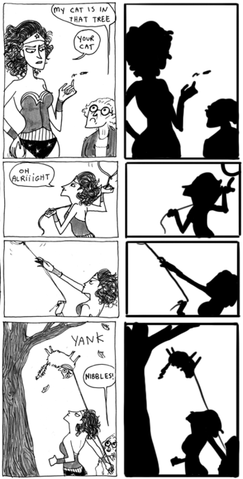
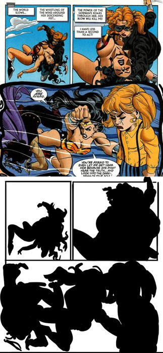
Readable gestures can make or break a scene. Compare Kate Beaton’s clear posing with Wonder Woman in these panels:
To this decidedly less readable Wonder Woman page:
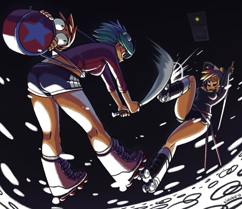
If what’s going on isn’t clear at the fundamental level, the details can’t save it. This isn’t, of course, to say that you can’t have a complex image that’s also readable. It just requires a lot more skill and attention:
All the essential elements are here above. The lines of action, the relevant silhouette intersections and the overall clarity of what’s happening.
As I’ve mentioned before, when blocking out a scene, it’s useful to identify a hierarchy of visual importance. In general, an isolated silhouette element has a higher visual importance than one that’s intersected with something else. By keeping the essentials clearly defined in silhouette and less important elements intersected or obscured in silhouette, you’ll more easily maintain clarity and effectively draw the reader’s eye to what’s most relevant in a scene. (I should note that when I say “importance” I mean the order in which things are viewed, not necessarily what’s literally most important in a scene.)
While silhouettes alone don’t determine all the essential information of a scene, they are more often than not the foundation. If the most important elements can’t be readable in a simplified form, it means the foundation needs to be reworked. This applies not only to panels and scenes, but to the designs of the characters and environments themselves.
If you can’t easily distinguish your characters by silhouette alone, they should be reworked. Silhouette recognition is a vital part of design, so vital in fact that I’m going to save it for my next post about character and costume designs!
Primary & Secondary: a Tale of Two Focal Points
In painting and general illustration, there are some basics everyone should know about composition. Chief amongst these is the importance of a focal point. A focal point is the primary focus of a picture, whether it’s a person, object or simply an abstract portion of the image. Humans have binocular, mammalian vision and our action of “looking” instinctively relies on focusing, not just seeing. Unless we’re looking at a magic eye 3D image, our eyes are only really comfortable with an image that has a clear focal point. Once that’s clear, we allow our eyes to wander and take in the other details.
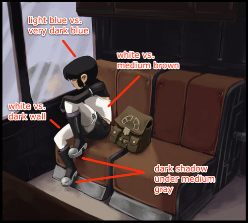
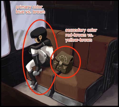
Achieving a solid focal point isn’t terribly difficult. A few tools that will help are contrast (overall the most indispensable):
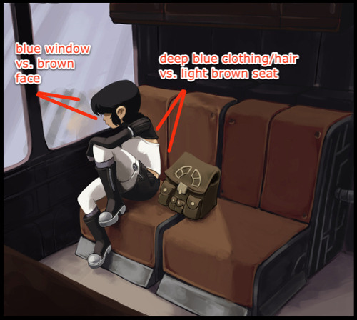
Complementary Colors (a subset of contrast):
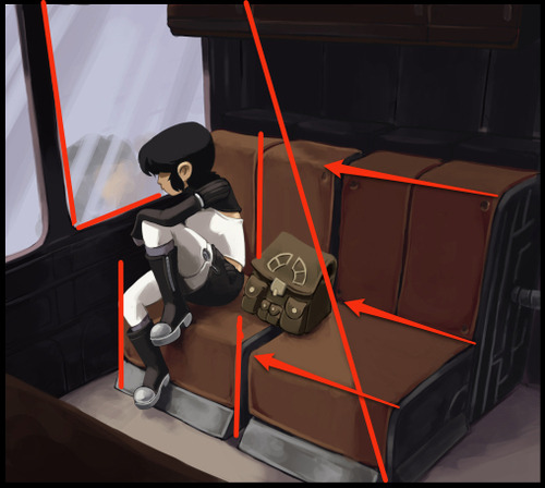
And overall structure:
However, these are the conventions of painting and illustration, which have somewhat different goals from comics. Comics, even in a single panel, employ the art of the visual narrative, which means there are unique demands for guiding the reader’s eye. Having a single focal point can be enough for some panels or images, but oftentimes it’s necessary for comics to employ multiple focal points in a single image to not only draw the eye in a meaningful, sequential fashion but also to heighten the reader’s excitement and immersion in the story.
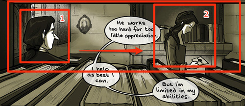
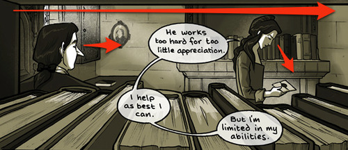
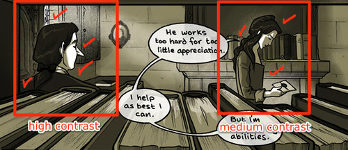
“Sequential art” doesn’t just refer to a sequence of panels, individual images also lead the eye in a sequential manner. There is a hierarchy of focal points that guide the reader through the visual narrative. In the above panel from Family Man, we see the above “focal point” tools being used to create a nice frame, but from there the composition is divided further, first focusing on the man, and then to the woman. A clear hierarchy within the visual sequence is established with some more advanced techniques.
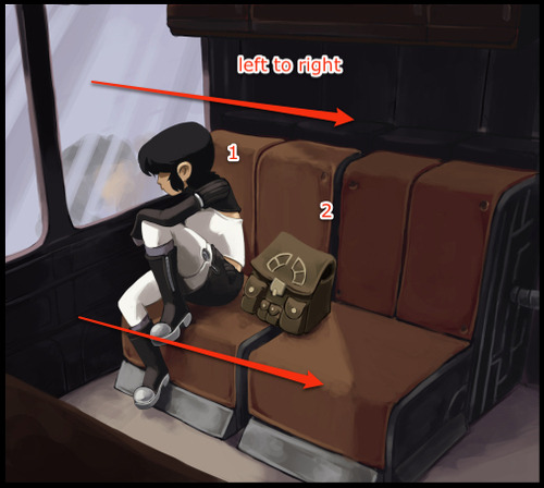
Gazes moving from left to right:
In Western comics, panels and text are read from left to right, so it’s in the best interest of the artist to take advantage of this natural habit of the reader’s eye. Unless forced to do otherwise, the reader is going to look at the top left corner of a comic image and move to the right. A reader will also instinctively look in the direction a character is looking, and in this panel the artist is taking advantage of both of these habits. We start on the man, who is looking at the woman, upon whom we then focus.
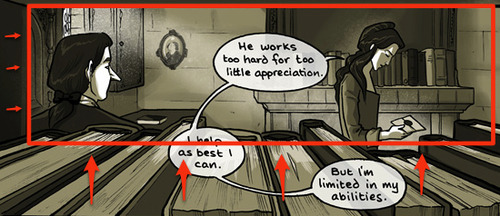
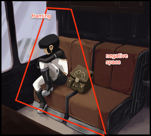
Framing:
There’s a frame created by the books and bookshelf that keeps the eye from drifting downward. This reinforces the previous technique of moving the eye from left to right. (Notice too the slight dip in books near the woman’s hand, drawing the eye to a third and softer focal point, ie: the letter).
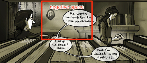
Soft division through negative space:
What largely separates the two focal points is a low detail negative space, where the contrast is low and the eye doesn’t linger. It also creates a 3D triangle of sorts: if we were shooting lasers out of our eyes, they would start at the man, ricochet off the wall and hit the woman.
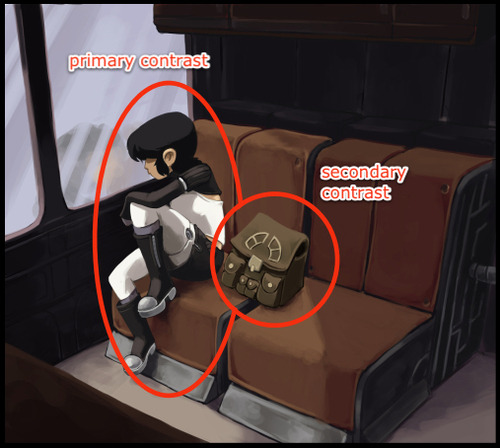
Primary and secondary contrast levels:
It’s subtle, but the values surrounding the man are more contrasted than the woman. This largely serves to reinforce the tools previously mentioned.
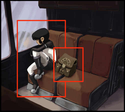
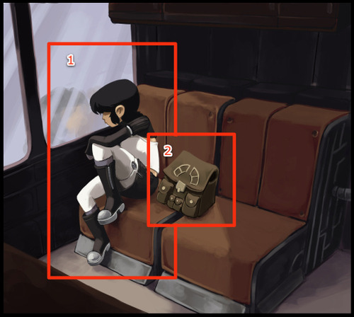
These types of techniques are also prevalent in the first image I showed, with Kimiko being the primary focus and her bag the secondary focus:
As you can see, the tools needed are slightly different, partially because of the larger colors used and other compositional requirements (for example, the image with Kimiko has a more complicated frame because it uses a 3-point perspective instead of 1). The point to take home is that there’s no one way to make this work; you may use some of these tools and not others, depending on what the image requires. Additionally, it should be noted we’re not limited to two focal points. Depending on the comic, there could be more. It all depends on what the visual narrative requires.
This is the key: no matter what the style, comics are a visual narrative. If we establish a clear sequence of visual relevance, the reader’s eye is active and their mind is engaged. Pull them into your world and keep them for a while.
Untitled
My cartoonist autograph shirt! This was taken when I had access to a large-format archival scanner at the OSU Cartoon Library in 2008, but back then, the t-shirt was only just starting to fill up on the front. It is now nearly covered in signatures from all the cartoonists I have met at conventions. I really ought to get some more up to date photos of it because it’s amazing.
The first people to sign it were Jeff Smith and Scott McCloud, which set a pretty high bar! A lot of the cartoonists I’ve since asked to sign it were often honored and humbled to share autograph space with them.
I had to stop taking it with me to shows because they’re so little room left to sign! (And also I’d be devastated if it got lost or stolen.) Putting this here as a reminder of all the amazing people I’ve gotten to meet over the years.
Untitled
How to paint music?
Oguna is playing a song for Phoenix. The Phoenix is so enchanted, that in the end she will offer him immortality. But now the only thing that matters are the sounds of Oguna’s flute filling the air.
Actually, this song was even written. The Phoenix series was an inspiration for British band System 7 to create a whole album. The Song for the Phoenix is one of its tracks. I will upload it soon.
From Phoenix: Yamato by Osamu Tezuka
Untitled
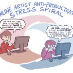
Don’t do it, man. Just say no. (And draw more comics.)
I don’t get it. What’s this blue half of the diagram about?
I catch myself doing this sometimes and I need to CUT THAT SHIT OUT
