Seeing as how I’ve done both the top ten for best and worst superhero costume redesigns, I feel obligated to put my money where my artistic mouth is and take a stab at fixing or updating some of these costumes. I’ll be taking a similar approach to my earlier take on Batman & Robin, where both the back story and design of each character are fair game. I’ve done five here, and chose them based on one of two criteria:
- It’s a particularly awful outfit that doesn’t fit the character, or
- It’s a solid character who just needs some updating or tweaking
I’ll list these in order of “reboot depth:”
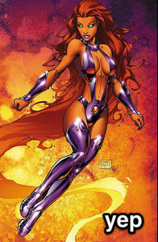
5. Starfire
What’s wrong: In the wake of DC’s “new 52” this felt like a no-brainer. Starfire is a decent character who’s always, in my opinion, gotten the short end of the costume stick. I get that she’s supposed to be sexually liberated and somewhat polyamorous, and that’s fine, but dressing like a John Carter’s Princess of Mars-themed stripper doesn’t cut it. Really, up until the Teen Titans cartoon she’s always been in the most awkward and impractical getups for someone fighting crime.
The Fix: I went for the simple route and took some notes from the cartoon (notably the skirt). I wanted to make sure it kept the bubbly, innocent feeling of the character while also hinting at some power (with the exposed arms here). The overall effect is meant to convey someone who’s tough, cheerful and comfortable flying around in the air.
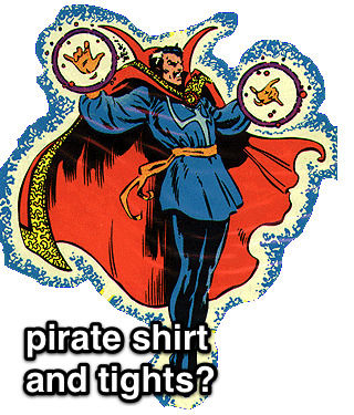
4. Dr. Strange
What’s wrong: I love Dr. Strange, but he’s always had the worst outfits. For a guy who basically hangs out in his house in the West Village, he seems to always wear the most ostentatious getups. He’s not an alien from another planet or from some culture that would dress that way, he’s a grown man who became a wizard well into adulthood. Nothing wrong with having some style while you’re maintaining the balance of the mystic planes.
The Fix: Two parts Vincent Price, one part Christopher Lee and one part Dr. Orpheus, this Dr. Strange is still magical, but with a more coherent design direction.
3. Ms. Marvel
What’s Wrong: Simply put, I think it’s embarrassing for Marvel to showcase a prominent character like Ms. Marvel and have her wearing that outfit. It’s just so tacky, and tells us nothing about the character. Basically they just changed the colors of Jean Grey’s Phoenix costume and exposed more skin. Come on, guys.
The Fix: Since her origins are ostensibly tied with Captain Marvel, I decided to go a route that’s more along the lines of the Ultimate Marvel version of that character, where her abilities come from alien technology rather than vague space magic. The notion that she’s, for example, permanently bound with this technology that she doesn’t fully understand can make for some interesting stories. There can be some potential with this character again with just a little bit of tweaking.
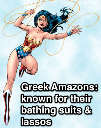
2. Wonder Woman
What’s Wrong: Wonder Woman, in my opinion, is a character that’s always been on the cusp of being really neat but never quite making it like Superman or Batman. Although a feminist pop icon, her origins are too tied up with creator WIlliam Marston’s obsession with bondage. Because of this (and an all-too-frequent parade of poor or sexist writing), she’s never had a solid, progressive design. The 21st century can update this character.
The Fix: One part Thor, three parts Xena. I’d push the mythological angle further. Just as nobody thinks of Thor as “Superman with a hammer” I don’t want Wonder Woman to be “girl Superman,” as she’s sometimes seen. I’ve also tweaked her origin slightly, making her a more literal “statue come to life.” This isn’t as extreme as it seems: in regular canon, Wonder Woman’s origin was that she was formed out of clay by the queen of the Amazons, and imbued with the powers of the Greek Gods. (Note: I am well aware that Greek statues were painted, but for aesthetic & thematic reasons it doesn’t work here. She’s just an old statue, so there wouldn’t be paint.) This, I think offers more story possibilities if she’s less literally human, physically. Her personality would remain the same (nothing more fun than the perspective of an Amazon in the modern world), but we now have an added Greek layer of Pygmalion or Telos.
The costume change is mostly conservative. Because of the strong fetish associations (and overall impracticality for a fighting Amazon), I’ve removed the lasso in favor of more traditional Greek weapons. The overall effect is intended to push Wonder Woman’s core themes further while making her also stand out as more than just “the female superhero.”
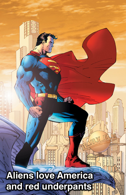
1. Superman
What’s Wrong: Since his creation, Superman’s drifted from being a progressive champion for the common man to a patriotic middle-America boyscout who represents the establishment and traditional values. When he was developed in the 30s, Superman was very much a Depression-era hero, mostly going after villains like crooked money lenders and saving people who were being abused by the system. His superpowers came from the fact that he was from a more advanced society, and his morals too were because he was simply a brainier, more sophisticated guy. During and following WW2 and into the Cold War, though, he became an official symbol for American values in particular (it was originally “Truth and Justice,” without “the American Way”). He was now not just an alien, but an alien raised by simple Kansas farmers and his abilities had a more generic “superpower” explanation. This is all fine, really, but I think the original concept is more compelling these days.
The Fix: Two parts Martian Manhunter and Ten parts Fleischer Superman. “Superman: the Man of Tomorrow, Strange Visitor from Another World.” I really want to push that. First off, Kryptonians should actually look like aliens and not white people. Here I have Kal-El from a race of beings whose technology and biology are long since indistinguishable (Clarke-esque space gods, you know the type). They’re strange to our mortal eyes but mean well. I’d keep the “destroyed planet” origin but more heavily emphasize the “non-interference” part of Superman’s mission statement.
If you’ll remember from the 70s movie, his father Jor-El told him he was forbidden to interfere with the course of human history, but when you think about it, that’s kind of vague. What I’ve done is added a Star Trek or Uatu the Watcher kind of prime directive to all advanced species: Kal-El can’t let people know that he’s an alien, nor can he openly interact with them using advanced technology. Still, he’s a compassionate guy and wants to help, so he takes the form of “Superman” to inspire the mortals in a constructive way. Also, the notion that he can take on different forms means that the Clark Kent secret identity need not be as bad as it currently is.
The costume redesign holds to the basic themes but makes it a little more working class. The buttons at the top are meant to invoke overalls, and the sleeves are cut a little higher for someone working with their hands. I’ve removed the spandex and gone with looser fitting slacks, while keeping a short cape and boots, since he’s still an adventurer.
Overall I want to evoke a classic Superman feel while making it a little more modern in its exploration of the sci fi themes. He’s still basically the same guy: an alien from another world looking to fight injustice, but without the overt patriotism and a quirkier execution of the secret identity.
*********************
So there you have it. I’ve hope you’ve enjoyed my superhero costume trilogy!