Untitled

belovedlights:

(tutorial)

i just did a cool thing that i think would be useful if you’re like me and sometimes have a hard time picking colours / a colour scheme for an image

basically i just took a brush with moderate spacing, turned on colour dynamics and set all the hue/sat/brightness to a low (~10%-30%) jitter, picked a base colour, and drew a line down the side of the canvas

it’s sort of like when some people save colour swatches so they can keep their shading consistent, but more for playing around with different tones and lighting on a single surface. it’ll probably be pretty good for skin which is very multi-tonal by nature.

a lot of colours came out that i probably wouldn’t have picked manually, but they still looked pretty cool. and it saves a lot of time because now i have a broad range of colours without having to browse through my pantone swatches or open up the colour picker.

click for more tutorials

5 Essential Superhero Redesigns!

dresdencodak:

Seeing as how I’ve done both the top ten for best and worst superhero costume redesigns, I feel obligated to put my money where my artistic mouth is and take a stab at fixing or updating some of these costumes.  I’ll be taking a similar approach to my earlier take on Batman & Robin, where both the back story and design of each character are fair game.  I’ve done five here, and chose them based on one of two criteria: 

  1. It’s a particularly awful outfit that doesn’t fit the character, or
  2. It’s a solid character who just needs some updating or tweaking

I’ll list these in order of “reboot depth:”

5. Starfire

image

What’s wrong: In the wake of DC’s “new 52” this felt like a no-brainer.  Starfire is a decent character who’s always, in my opinion, gotten the short end of the costume stick.  I get that she’s supposed to be sexually liberated and somewhat polyamorous, and that’s fine, but dressing like a John Carter’s Princess of Mars-themed stripper doesn’t cut it.  Really, up until the Teen Titans cartoon she’s always been in the most awkward and impractical getups for someone fighting crime.

image

The Fix: I went for the simple route and took some notes from the cartoon (notably the skirt). I wanted to make sure it kept the bubbly, innocent feeling of the character while also hinting at some power (with the exposed arms here).  The overall effect is meant to convey someone who’s tough, cheerful and comfortable flying around in the air.

4. Dr. Strange

image

What’s wrong: I love Dr. Strange, but he’s always had the worst outfits.  For a guy who basically hangs out in his house in the West Village, he seems to always wear the most ostentatious getups.  He’s not an alien from another planet or from some culture that would dress that way, he’s a grown man who became a wizard well into adulthood.  Nothing wrong with having some style while you’re maintaining the balance of the mystic planes.

image

The Fix: Two parts Vincent Price, one part Christopher Lee and one part Dr. Orpheus, this Dr. Strange is still magical, but with a more coherent design direction.

3. Ms. Marvel

image

What’s Wrong: Simply put, I think it’s embarrassing for Marvel to showcase a prominent character like Ms. Marvel and have her wearing that outfit.  It’s just so tacky, and tells us nothing about the character.  Basically they just changed the colors of Jean Grey’s Phoenix costume and exposed more skin.  Come on, guys.

image

The Fix: Since her origins are ostensibly tied with Captain Marvel, I decided to go a route that’s more along the lines of the Ultimate Marvel version of that character, where her abilities come from alien technology rather than vague space magic.  The notion that she’s, for example, permanently bound with this technology that she doesn’t fully understand can make for some interesting stories.  There can be some potential with this character again with just a little bit of tweaking.

2. Wonder Woman

image

What’s Wrong: Wonder Woman, in my opinion, is a character that’s always been on the cusp of being really neat but never quite making it like Superman or Batman.  Although a feminist pop icon, her origins are too tied up with creator WIlliam Marston’s obsession with bondage.  Because of this (and an all-too-frequent parade of poor or sexist writing), she’s never had a solid, progressive design.  The 21st century can update this character.

image

The Fix: One part Thor, three parts Xena. I’d push the mythological angle further.  Just as nobody thinks of Thor as “Superman with a hammer” I don’t want Wonder Woman to be “girl Superman,” as she’s sometimes seen.  I’ve also tweaked her origin slightly, making her a more literal “statue come to life.” This isn’t as extreme as it seems: in regular canon, Wonder Woman’s origin was that she was formed out of clay by the queen of the Amazons, and imbued with the powers of the Greek Gods.  (Note: I am well aware that Greek statues were painted, but for aesthetic & thematic reasons it doesn’t work here. She’s just an old statue, so there wouldn’t be paint.) This, I think offers more story possibilities if she’s less literally human, physically.  Her personality would remain the same (nothing more fun than the perspective of an Amazon in the modern world), but we now have an added Greek layer of Pygmalion or Telos.

The costume change is mostly conservative.  Because of the strong fetish associations (and overall impracticality for a fighting Amazon), I’ve removed the lasso in favor of more traditional Greek weapons.  The overall effect is intended to push Wonder Woman’s core themes further while making her also stand out as more than just “the female superhero.”

1. Superman

image

What’s Wrong: Since his creation, Superman’s drifted from being a progressive champion for the common man to a patriotic middle-America boyscout who represents the establishment and traditional values. When he was developed in the 30s, Superman was very much a Depression-era hero, mostly going after villains like crooked money lenders and saving people who were being abused by the system.  His superpowers came from the fact that he was from a more advanced society, and his morals too were because he was simply a brainier, more sophisticated guy.  During and following WW2 and into the Cold War, though, he became an official symbol for American values in particular (it was originally “Truth and Justice,” without “the American Way”).  He was now not just an alien, but an alien raised by simple Kansas farmers and his abilities had a more generic “superpower” explanation.  This is all fine, really, but I think the original concept is more compelling these days.

image

The Fix: Two parts Martian Manhunter and Ten parts Fleischer Superman. “Superman: the Man of Tomorrow, Strange Visitor from Another World.” I really want to push that.  First off, Kryptonians should actually look like aliens and not white people. Here I have Kal-El from a race of beings whose technology and biology are long since indistinguishable (Clarke-esque space gods, you know the type).  They’re strange to our mortal eyes but mean well.  I’d keep the “destroyed planet” origin but more heavily emphasize the “non-interference” part of Superman’s mission statement.  

If you’ll remember from the 70s movie, his father Jor-El told him he was forbidden to interfere with the course of human history, but when you think about it, that’s kind of vague.  What I’ve done is added a Star Trek or Uatu the Watcher kind of prime directive to all advanced species:  Kal-El can’t let people know that he’s an alien, nor can he openly interact with them using advanced technology.  Still, he’s a compassionate guy and wants to help, so he takes the form of “Superman” to inspire the mortals in a constructive way.  Also, the notion that he can take on different forms means that the Clark Kent secret identity need not be as bad as it currently is.

The costume redesign holds to the basic themes but makes it a little more working class.  The buttons at the top are meant to invoke overalls, and the sleeves are cut a little higher for someone working with their hands.  I’ve removed the spandex and gone with looser fitting slacks, while keeping a short cape and boots, since he’s still an adventurer.

Overall I want to evoke a classic Superman feel while making it a little more modern in its exploration of the sci fi themes.  He’s still basically the same guy:  an alien from another world looking to fight injustice, but without the overt patriotism and a quirkier execution of the secret identity.

*********************

So there you have it.  I’ve hope you’ve enjoyed my superhero costume trilogy!

Part 1: The Best Superhero/Villain Redesigns

Part 2: The Worst Superhero/Villain Redesigns

A gentle reminder: If you changed your Facebook profile picture, you should go do something real, too.

adulting:

image
I’m not knocking the red — in fact, red Grumpy Cat is currently what Facebook thinks I look like — and I’ve heard from many LGBT friends, particularly older ones, that it’s a touching reminder of all their straight allies. 

But it is not, in and of itself, work. And if you want to carry this mantle, if you think it’s important (and I hope you do) then put some skin in the game. Volunteer for a group that advocates for queer rights; donate a little money; figure out what your talent/ability is and offer it. 

Figures: They Speak For Themselves (mildly NSFW)

dresdencodak:

image

Continued from the last article about costume design, today we’re going to talk about those wacky things you hide underneath clothing.  Figure drawing is a pivotal tool to any artist, but being able to effectively render humans and creatures is only part of the equation.  Even if your draftsmanship is solid, you won’t get far if your designs are uninteresting.  Effective and dynamic figures are the cornerstone of having compelling characters in pretty much any comic.

The Purpose of Character Design

image

The focus of art in general is to generate a particular response out of your audience; the mechanics of what you literally create are often secondary to this goal.  Something can be abstract or literal, but the point in both cases is the effect is has on the viewer/listener/reader; the creation itself is a means to an end.  In comics, authenticity and realism are not defined by what you are actually drawing, but rather how your drawings are viewed by your reader.  In the context of a visual narrative, a simplistic drawing can be “more real” than a more realistically rendered one if that simplistic drawing evokes a more authentic response.  A stickman can be a more convincing character than a photorealistic painting; it all depends on how that stickman is conveyed.

When you design your characters, you have an opportunity to both communicate information about them, as well as provide a conduit through which information about other characters and even environments can be shown.  Their appearances can augment the actions in the narrative, or even take the place of regular action.

Focused Caricature

image

When designing characters for comics, then, it’s not universally important to faithfully recreate how people look in real life or even caricature real life.  This may sound contentious at first glance.  After all, isn’t a big part of cartooning exaggerating elements of real life?  Certainly, but that’s only half of the equation when it comes to visual narratives. A regular caricature is mostly about emphasizing what’s visually obvious, and while that’s still present in comics and animation, on top of that there’s often the need to convey information about the character.  Even if you’re basing a design on a real person, what you choose to emphasize can determine how the audience views that character.  Again, what part of “reality” (in this case people’s appearances) you select to share can profoundly change how those characters are perceived.

image

Implied Motion

While they can be very similar, a fundamental difference between the needs of comic design versus animation design is the presence of literal motion.  

image

In animation you can give your character a nervous tick, a particular walking pattern, or any other number of facial and other motion cues to add flavor and depth to a character.  However, with the static images of comics, this approach is limited.  As such, more pressure is placed upon the designs themselves because they’re the primary visual resource the reader has for gaining information about the character.  Luckily, there’s a plethora of tools at our disposal for doing just that.  The shape, size and position of a figure can be designed in such a way that it implies motion.  Upturned brows and lips can suggest someone who is frequently bemused, an exaggerated posture can give the impression of a certain type of gait, and so on.  And since the reader’s eye can dwell on a comic panel indefinitely (at least in theory), there’s more freedom to employ subtler facial and body elements to add to a character’s flavor. 

The Body

Shape Up

image

Silhouettes and overall shape are the first pieces of information to reach the reader, and because of this they will always dominate any character’s design.  If your silhouette isn’t doing its job, the rest won’t matter.  Starting with a simple, clear shape and working backwards is a good rule of thumb.  And while this is naturally easier with monsters and other fantastical creatures, it applies just as much to regular people.

Body Types

image

People are not divided into skinny/fat/muscular.  While these body states do obviously exist, each of these will still differ from person to person.  For example, there’s not a single “athletic” body type, but dozens (as this amazing photo series shows). Don’t fall into the trap of old superhero comics where everyone looks like a bunch of clones wearing different costumes.  People’s builds, postures, hands, feet and musculatures are extremely diverse, going far beyond simple factors like age, height and weight.

Body Language

image

Your character’s motions can inform you quite a bit on how you could design their form.  If a character often stoops or shuffles, you can warp his or her spine and posture to bring attention to that sort of behavior.  In general, you want the figure to emphasize and accentuate the type of body language indicative of that person.  This is really important.  In animation, there’s a little less of a required connection between body language and design because you can literally show motion, but with comics being a static medium,  you have to imply a lot of motion without showing it.  Naturally, if your character has a very wide range of motion, your design should reflect that too.  Main characters aren’t usually designed around a single posture, for example, but side ones often are.  In the end, this is all a tool to efficiently communicate information about a character to the audience.

The Head

Shapes Again

Even more so than with the body, you should be able to reduce each character’s head to a fairly recognizable shape.  This is the foundation for developing a good head silhouette, which is vital because the focus of a page is often on peoples’ faces; recognition should be established on a subconscious level with little to no effort on the part of the reader. 

image

image

image

If the reader can’t immediately and clearly distinguish who is who without using details, the designs are bad.  Also note: using hair alone to distinguish heads is cheating. Similar to the superhero body problem, don’t fall into the crappy anime trap of having identical heads that are only distinguishable by their wacky hair.  Obviously hair is a component of character design, but to rely exclusively on it is taking a shortcut that only ends in sloppy composition and no variety.  

image

Similar to the Naked Test (which we’ll talk more about shortly), you should be able to immediately distinguish all your character’s heads without any adornments or hair.  Shave ‘em down and compare.  

Variety is Your Friend

image

image

Ears, eyebrows, skulls, eyes, eyelids, noses, cheekbones, nostrils, hairlines, necks- these are all elements that will vary from person to person.  Don’t be afraid to go beyond normal human proportions.  Exaggerating or simplifying to the point of even being a stickman is perfectly fine, so long as it suits what you’re trying to do.

Dominant Expressions

What types of facial expressions and body language do your characters exhibit?  Main characters generally require more of a range than side characters, while less three-dimensional characters can be designed to fit only a handful of expressions.  image

A lot of character information can be shown to the audience this way.  Showing rather than telling your readers means you’re playing to the medium’s strengths.

The Naked Test

image

image

Once you’ve designed your figures, we move on to the Naked Test.  When developing a cast or even just a couple of characters, they should always be instantly recognizable without the aid of clothing.  Even if their clothes have some key distinguishing elements to them (which they probably should), the bodies themselves are the foundation, and if the foundation is too generic, then you’re left with a flat design that can’t be corrected by adding stuff on top.  All the basics should be present at this level: distinguishable silhouettes, unique body types and proportions, and unique facial shapes should all be there to tell your character’s story.

Figure drawing isn’t easy.  Because we’re hard-wired to distinguish even the tiniest variance in human appearance, there’s a lot of pressure to get figures right compared to other subjects.  As such, it’s easy to play it safe with conservative designs that don’t strain our draw-muscles, but it’s important to push past that. Effective and compelling character design is a skill that’s indispensable for cartooning of every kind.

Costumes: the Wearable Dialog

dresdencodak:

image

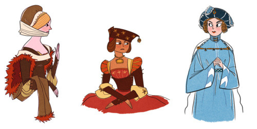
I mentioned before some of my favorite character designs in the world of comics and have been meaning to tackle this subject again.  I came to realize, however, that “character design” is itself a fairly massive subject, and that it would be best to break the topic down into separate installments.  Today, true believers, we’re going to talk about outfits and costumes, which are often a pivotal part of a character’s design.

3 Essential Questions

Clothing can convey quite a bit of conscious and unconscious information to the reader, but it should never be doing 100% of the legwork.  Body language, shape and overall behavior all come into play when building a character, and the trick is to figure out what clothing can do that these other elements can’t.  To get started, it’s important to ask some basic questions about your character before jumping into costume design.

1) Costume Hierarchy

image

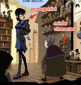
How often does this character appear?  Is it a main character or a side one? Primary characters have more complex needs than side characters, which is to say that the more information you have about your character, the more that can be conveyed in their appearance.  Additionally, the more frequent the character appears, the more versatile the design needs to be.

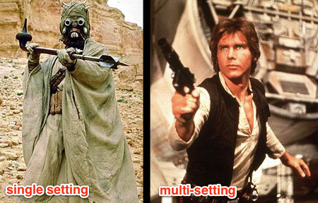
2) Environmental Relationship

image

If it’s a side character that only ever appears in one setting, for example, you need only design the outfit to fit in that environment.  If they are a main character, though, chances are you’ll need the outfit to mesh with more than one setting.  
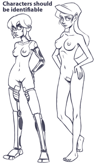
3) The Naked Test

image

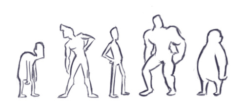
Is your character recognizable without any clothes on?  Body types, especially those of the main cast, should be distinctive even without the help of any outfits.  The naked form is the foundation of all character design.  Before you start dressing your body, make sure it’s a body worth dressing.

image

Once you’ve sufficiently answered these questions, it’s time to jump into the actual design phase!

Shape

image

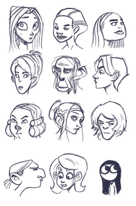
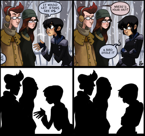
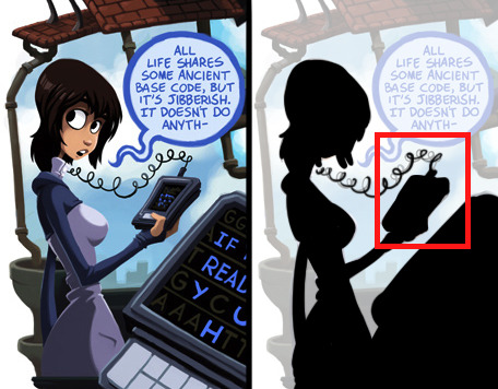
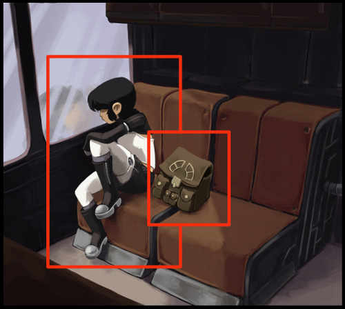
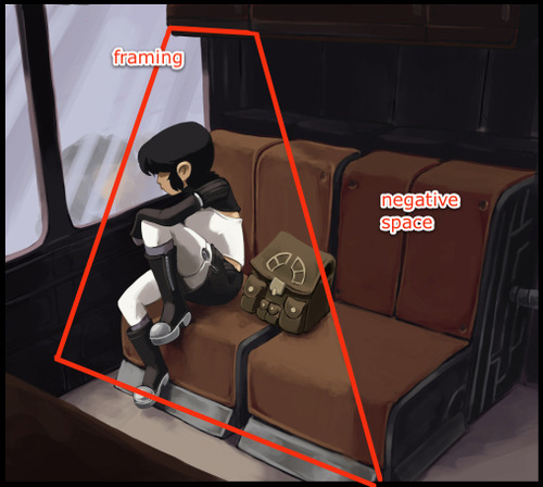
Every character, no matter how complex, should be designed around an overal unique visual shape.  This theme should not repeat in any other character.  This shape should be readable enough that if you were to shrink all your characters into a super-simplified cartoony state, they should still be distinguishable.  Character designs follow a hierarchy: you grab the reader’s attention with the most essential information and then invite them to investigate the details.  If important elements of your design are only evident in the details, then it needs to be reworked.  If your character is not completely distinguishable in silhouette, it needs to be reworked.  Detail should always radiate from the core theme.

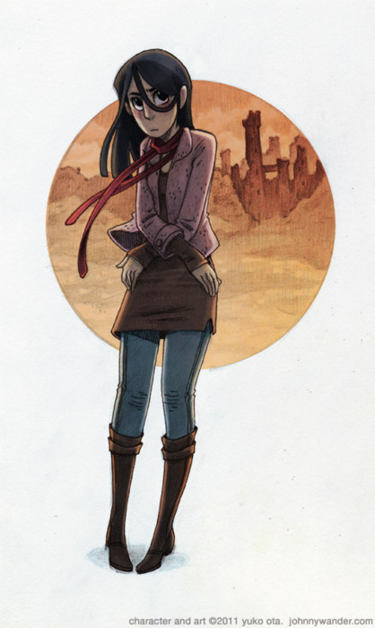
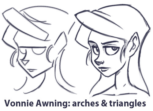
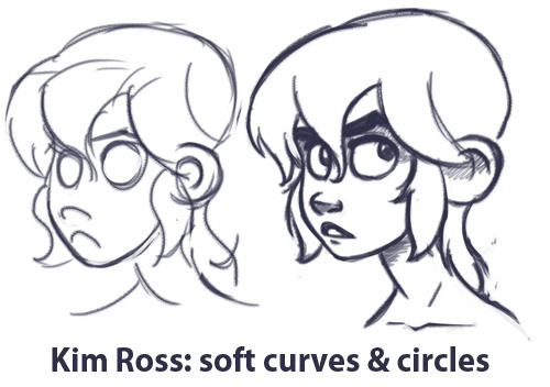
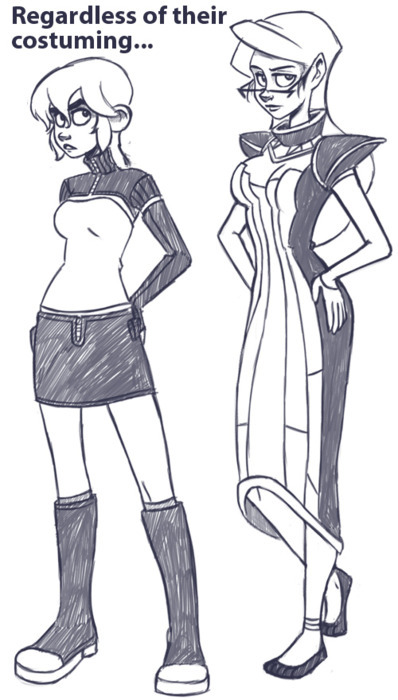
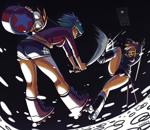
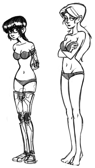
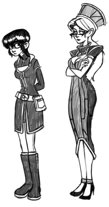
Kim and Vonnie stay distinct in a few ways.  

image

image

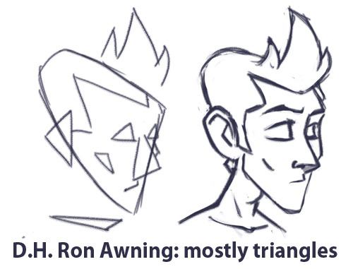
The primary difference in shape between the above two characters is one of curves versus triangles.  Vonnie is very angular, and her clothing’s angles mimic the scaffolding of an art deco building to emphasize her height and posture.  Kim’s outfit makes her look shorter, but jaunty.  There are a lot of soft curves going on there to make her seem younger and more innocent.

Action

image

What does your character do?  In what way would their clothing reasonably convey how they spend their time?  This is an easy question if it’s a uniformed occupation, but it certainly doesn’t stop there.  A more bookish or socially inept character is often prone to mismatched clothing, while a person of a very high social status is often wearing clothing that is physically less practical than those of the working class.

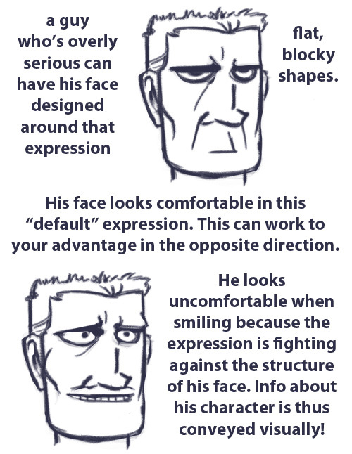
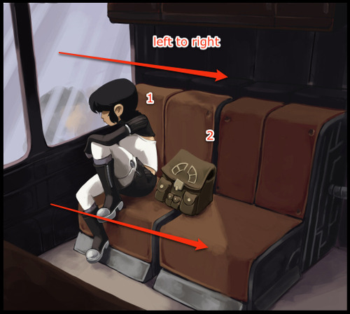
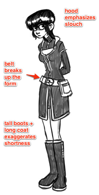
How does your character move?  What are their default postures and body language?  A good outfit should accentuate the body movements that you deem most important.  If a character stoops and hunches a lot, their clothes can augment that behavior.  For example, Kim is frequently hunched over, so I tend to dress her with a hood that’s shaped to go with poor posture, as well as a repeating “arch” shape to suggest this basic form.

Communication

image

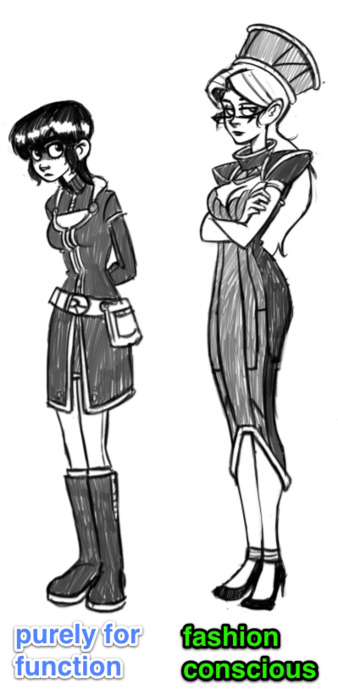
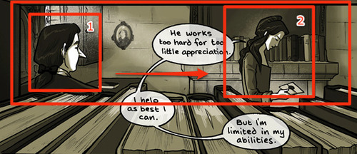
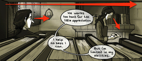
How much does the character wish to communicate with their clothing?  Not everyone wears their personality on their sleeve, nor is everyone especially fashion-conscious.  Nothing’s worse than having a cast where everyone is immaculately dressed and overdesigned.  A more outgoing character might be more aware of their appearance, while a more introverted one may be less concerned.  To add another layer, a character may dress a certain way to disguise something they don’t want to show to others, just as someone might act overconfidently to hide their insecurities.  You can tell your audience a lot about your character through what that character chooses to display to others.

Repetition

Core shapes and patterns should repeat on the outfit.  The entire design should exhibit some bilateral cohesion, which is to say if you were to cut the character in half horizontally or vertically, each part should look like it belongs to the other.  

image

image

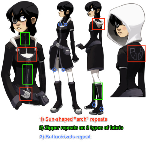
As mentioned, Kim has a lot of solid colors and arch shapes which are broken up by fabric and metal seams, with very few sharp edges.  

image

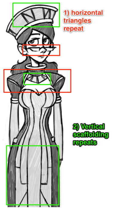
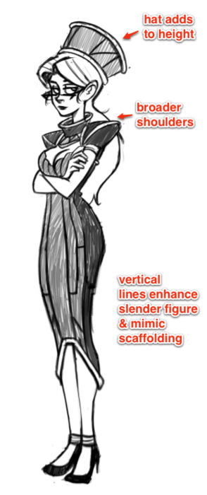
Vonnie, on the other hand, is structured almost like a building, with vertical lines and triangles that take the shape of supporting beams on the surface of her outfit.  Her triangles and broad horizontal planes repeat throughout her outfit, including her glasses.

image

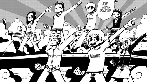
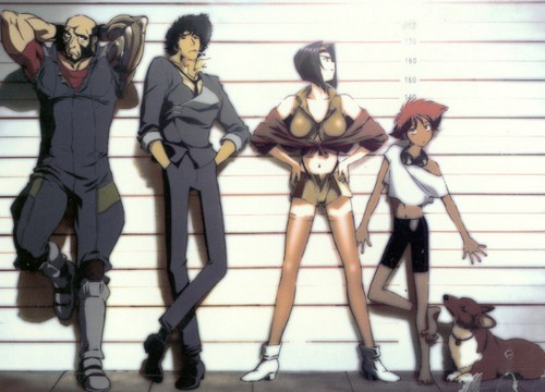
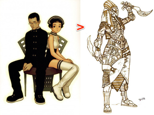
This extends to multiple costumes worn by the same character.  Even if a particular character changes clothes, the core shapes should still be evident.  Scott Pilgrim is a good example of this.  Most of the cast change clothes frequently, but in each scene it’s generally easy to recognize the characters by the “type” of clothing they choose.  The details change, but the essential shapes do not.
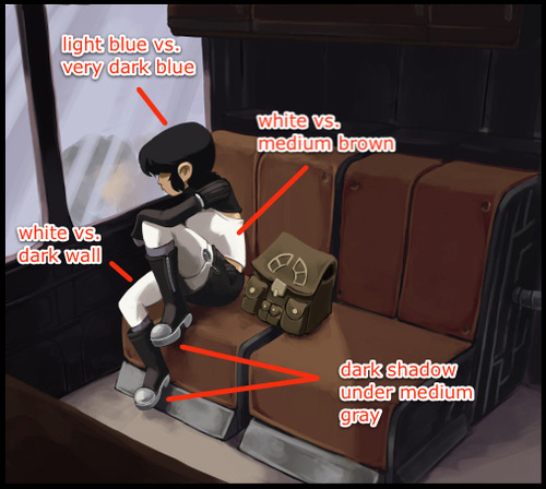
Color and Contrast

image

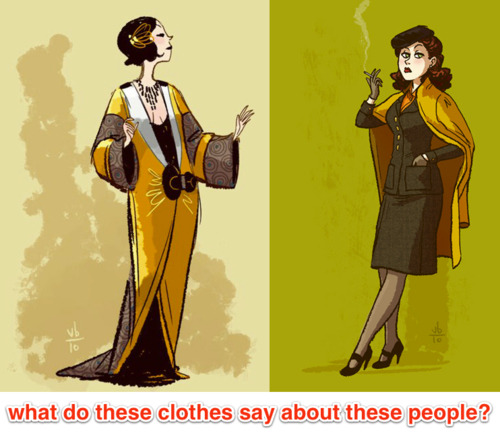
Different colors can imply different moods.  ”Winter” colors like cooler blues and purples can suggest an introspective or reserved personality, while warmer colors like yellow or red can imply a more energetic attitude.  If your character only ever interacts in one type of setting, you only have to worry about how those colors will fit in one environmental color palette.  If, however, your character needs to mesh well with more than one environment (as is usually the case with protagonists), you have to make sure your character’s colors will fit with multiple settings.

image

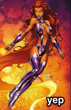
Also, don’t be fooled by superhero comics: it’s generally bad form to have two dominant colors in a single costume.  My personal rule of thumb is to have no more than one prime color in an outfit design, followed by a secondary and then supporting colors.  

image

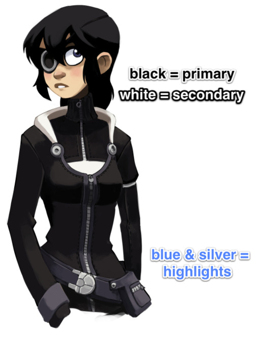
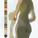
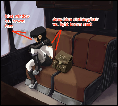
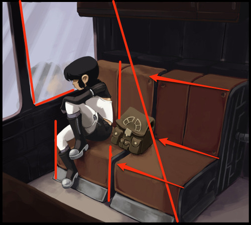
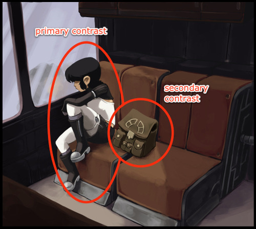
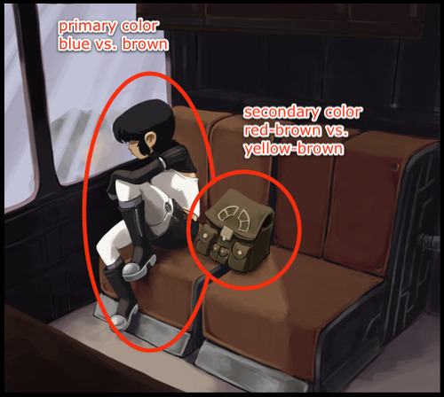
In the case of Kim’s outfit in Dark Science, the primary color is black, with the secondary being off-white.  These are then supported by the muted blue and silver accents that appear in both her prosthetics and clothing.  Color and value contrast is very important, especially for a main character, which is why Kim’s basic palette can be reduced to black and white without losing any essential information.  

image

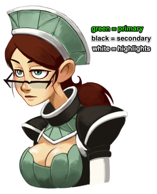
Vonnie’s outfit is more colorful, but less contrasted as a whole.  Green dominates and is blocked in by a secondary, warmer black.  Green is the complementary color of red, and so her clothes naturally bring attention to her hair and reddish skin tone, inherently highlighting more sexual elements than Kim (whose black outfit essentially matches her hair).  White is also present, but it’s only a supporting color here.

Simplicity

image

Above all else, keep it simple.  Comic characters are not pin-ups or other illustrations; you have to draw them over and over again, from various angles.  If you pile on too much detail, you’ll wear yourself out slogging through all the bits every time you have to draw them.  

If you follow all these rules, good costume design should create this basic pattern when presented to a reader:

  1. Read:  Silhouettes and essential shapes should be instantly recognizable
  2. Inform:  The costume should then tell the reader essential things about the character
  3. Compel:  The costume should then invite the reader to learn more about the character
  4. Move:  The costume should never impede the flow of action within the comic

If you stick to these basic guidelines, you’ll never fail.  Next up on character design: bodies and faces!

Silhouettes: the Silent Killer

dresdencodak:

image

The eye isn’t a camera.  When we view objects, especially moving objects, our brains tend to break them down not into a collection of varying hues, but rather silhouettes.  Quick object identification is a primal evolutionary necessity, and it’s a foundational way our visual interpretation works.  It’s why camouflage works too.

image

When an object’s silhouette is difficult to make out, we have a tough time keeping track of what we’re seeing.  It’s why so many comics and drawings use the visual shorthand out outlining figures and objects.  The shades and values of an object are secondary to the basic shape when it comes to recognition.  As such, effectively managing silhouettes is a vital tool for visual narratives.

image

Essentially, the general rule is if you were to fill in your characters and objects with black, you should still be able to tell what they’re doing.  All the most essential elements need to be far enough away from the “body” or primary silhouette so that they are distinguishable.  The less important elements don’t need to be isolated this way.  In the above image, the only two significant things we need to know is that 1) Kim is talking with Ron and Vonnie, and 2) that she is gesturing in an explanatory way and then retreating her gesture.  Simple as that.

Readable gestures can make or break a scene. Compare Kate Beaton’s clear posing with Wonder Woman in these panels:

image

To this decidedly less readable Wonder Woman page:

image

If what’s going on isn’t clear at the fundamental level, the details can’t save it.  This isn’t, of course, to say that you can’t have a complex image that’s also readable.  It just requires a lot more skill and attention:

image

All the essential elements are here above.  The lines of action, the relevant silhouette intersections and the overall clarity of what’s happening.

image

As I’ve mentioned before, when blocking out a scene, it’s useful to identify a hierarchy of visual importance. In general, an isolated silhouette element has a higher visual importance than one that’s intersected with something else. By keeping the essentials clearly defined in silhouette and less important elements intersected or obscured in silhouette, you’ll more easily maintain clarity and effectively draw the reader’s eye to what’s most relevant in a scene.  (I should note that when I say “importance” I mean the order in which things are viewed, not necessarily what’s literally most important in a scene.)

image

image

image

While silhouettes alone don’t determine all the essential information of a scene, they are more often than not the foundation.  If the most important elements can’t be readable in a simplified form, it means the foundation needs to be reworked.  This applies not only to panels and scenes, but to the designs of the characters and environments themselves.  

image

image

If you can’t easily distinguish your characters by silhouette alone, they should be reworked.  Silhouette recognition is a vital part of design, so vital in fact that I’m going to save it for my next post about character and costume designs!

Drawing Hands: Augmenting an Idea

dresdencodak:

image

Most people understand the importance of facial expressions in cartooning, but if there’s anything that’s routinely neglected, it’s hands.  It’s a shame too, since hands are the second thing we instinctively look at when a person is speaking to us.  We use our hands in a variety of ways to accentuate our point; if we actively restrict ourselves from gesturing at all, natural speech actually become rather difficult.  This goes beyond dialogue, too: hand gestures lead us to what’s important, and they’re the most frequent body part to indicate action and interaction with the environment, as well as other characters.  Hands dominate the focus on what’s important in a scene, and to neglect this is to neglect a pivotal tool in storytelling.

image

The Meek is an excellent example of a webcomic that knows how to use hands.  They’re not just used to accentuate a gesture or mood, but different characters have different habits of gestures, just like real life people.  Whether it’s a subtle gesture (indicating a sort of royal calm) like above, or an indication of surprise or bewilderment:

image

An innocent investigation:

image

Or visible frustration:

image

In the above image, we go from the girl’s hands centered in the frame, almost mirrored.  It keeps the focus dead center and the composition flat.  Then the “camera” shifts to the left, bringing us out of that moment of mental processing and onto the action.  Her right hand gestures outward, and we instinctively want to follow it to the next scene, whatever that may be.

image

Enrique Fernandez does an especially good job of hand interaction with other objects and faces.  They allow us to focus on what’s most important in a scene.  Guiding the eye is a central part of comic art, and hands are an efficient way to achieve this.

image

image

Despite being lavishly detailed, there’s never any confusion as to what the focal point is in each panel.  If the reader has to try too hard to figure out what’s important, they lose interest in the visual path of the image and may lose interest in the comic altogether.

image

Hands need not be realistic or detailed to achieve their purpose.  Octopus Pie is a very “cartoony” comic, but there’s an economy of movement and composition in every panel to get the main point across.  Hands are not afraid to touch objects and gesture appropriately. There’s a definite language to the characters’  gestures as well, and no two characters use their hands the same way.

image

image

Hark, a Vagrant is an even more extreme example.  There’s really very little realism to the forms in general, especially the hands, but still they are extremely expressive and clearly readable.  There’s never any confusion as to how a character is behaving or feeling.

image

In short, hands are a big thing we look for when engaging a person.  Regardless of style, if an artist wants to have relatable or engaging characters, those characters have to move and act like people, and those people need to be gesturing in a way that moves the action forward clearly and effectively.

Primary & Secondary: a Tale of Two Focal Points

dresdencodak:

image

In painting and general illustration, there are some basics everyone should know about composition.  Chief amongst these is the importance of a focal point.  A focal point is the primary focus of a picture, whether it’s a person, object or simply an abstract portion of the image.  Humans have binocular, mammalian vision and our action of “looking” instinctively relies on focusing, not just seeing.  Unless we’re looking at a magic eye 3D image, our eyes are only really comfortable with an image that has a clear focal point.  Once that’s clear, we allow our eyes to wander and take in the other details.

Achieving a solid focal point isn’t terribly difficult.  A few tools that will help are contrast (overall the most indispensable):

image

Complementary Colors (a subset of contrast):

image

And overall structure:

image

However, these are the conventions of painting and illustration, which have somewhat different goals from comics.  Comics, even in a single panel, employ the art of the visual narrative, which means there are unique demands for guiding the reader’s eye.  Having a single focal point can be enough for some panels or images, but oftentimes it’s necessary for comics to employ multiple focal points in a single image to not only draw the eye in a meaningful, sequential fashion but also to heighten the reader’s excitement and immersion in the story.

image

“Sequential art” doesn’t just refer to a sequence of panels, individual images also lead the eye in a sequential manner.  There is a hierarchy of focal points that guide the reader through the visual narrative.  In the above panel from Family Man, we see the above “focal point” tools being used to create a nice frame, but from there the composition is divided further, first focusing on the man, and then to the woman.  A clear hierarchy within the visual sequence is established with some more advanced techniques.

Gazes moving from left to right:

image

In Western comics, panels and text are read from left to right, so it’s in the best interest of the artist to take advantage of this natural habit of the reader’s eye.  Unless forced to do otherwise, the reader is going to look at the top left corner of a comic image and move to the right.  A reader will also instinctively look in the direction a character is looking, and in this panel the artist is taking advantage of both of these habits.  We start on the man, who is looking at the woman, upon whom we then focus.

Framing:

image

There’s a frame created by the books and bookshelf that keeps the eye from drifting downward.  This reinforces the previous technique of moving the eye from left to right.  (Notice too the slight dip in books near the woman’s hand, drawing the eye to a third and softer focal point, ie: the letter).

Soft division through negative space:

image

What largely separates the two focal points is a low detail negative space, where the contrast is low and the eye doesn’t linger.  It also creates a 3D triangle of sorts:  if we were shooting lasers out of our eyes, they would start at the man, ricochet off the wall and hit the woman.

Primary and secondary contrast levels:

image

It’s subtle, but the values surrounding the man are more contrasted than the woman.  This largely serves to reinforce the tools previously mentioned.

These types of techniques are also prevalent in the first image I showed, with Kimiko being the primary focus and her bag the secondary focus:

image

image

image

image

image

As you can see, the tools needed are slightly different, partially because of the larger colors used and other compositional requirements (for example, the image with Kimiko has a more complicated frame because it uses a 3-point perspective instead of 1).  The point to take home is that there’s no one way to make this work; you may use some of these tools and not others, depending on what the image requires.  Additionally, it should be noted we’re not limited to two focal points.  Depending on the comic, there could be more.  It all depends on what the visual narrative requires.

This is the key: no matter what the style, comics are a visual narrative.  If we establish a clear sequence of visual relevance, the reader’s eye is active and their mind is engaged.  Pull them into your world and keep them for a while.