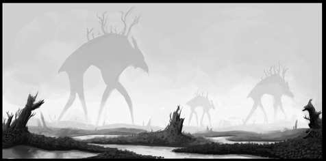
The eye isn’t a camera. When we view objects, especially moving objects, our brains tend to break them down not into a collection of varying hues, but rather silhouettes. Quick object identification is a primal evolutionary necessity, and it’s a foundational way our visual interpretation works. It’s why camouflage works too.
When an object’s silhouette is difficult to make out, we have a tough time keeping track of what we’re seeing. It’s why so many comics and drawings use the visual shorthand out outlining figures and objects. The shades and values of an object are secondary to the basic shape when it comes to recognition. As such, effectively managing silhouettes is a vital tool for visual narratives.
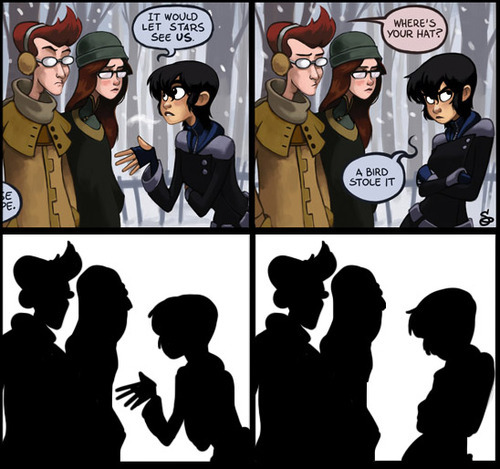
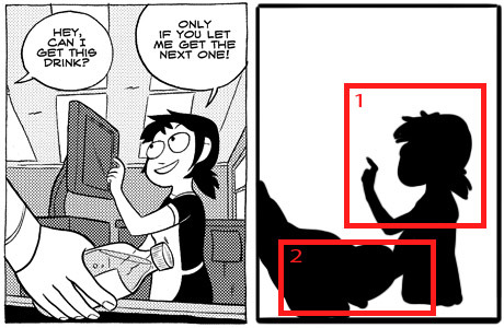
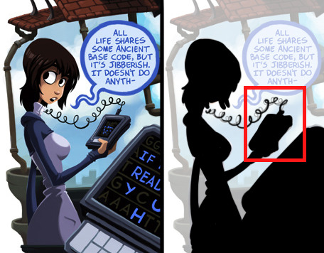
Essentially, the general rule is if you were to fill in your characters and objects with black, you should still be able to tell what they’re doing. All the most essential elements need to be far enough away from the “body” or primary silhouette so that they are distinguishable. The less important elements don’t need to be isolated this way. In the above image, the only two significant things we need to know is that 1) Kim is talking with Ron and Vonnie, and 2) that she is gesturing in an explanatory way and then retreating her gesture. Simple as that.
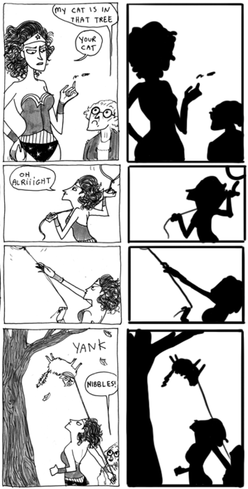
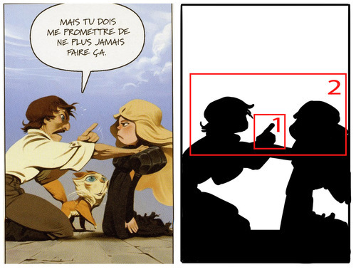
Readable gestures can make or break a scene. Compare Kate Beaton’s clear posing with Wonder Woman in these panels:
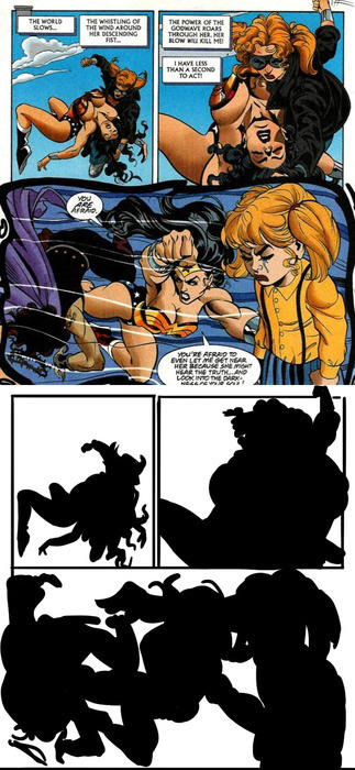
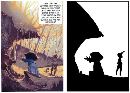
To this decidedly less readable Wonder Woman page:
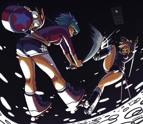
If what’s going on isn’t clear at the fundamental level, the details can’t save it. This isn’t, of course, to say that you can’t have a complex image that’s also readable. It just requires a lot more skill and attention:
All the essential elements are here above. The lines of action, the relevant silhouette intersections and the overall clarity of what’s happening.
As I’ve mentioned before, when blocking out a scene, it’s useful to identify a hierarchy of visual importance. In general, an isolated silhouette element has a higher visual importance than one that’s intersected with something else. By keeping the essentials clearly defined in silhouette and less important elements intersected or obscured in silhouette, you’ll more easily maintain clarity and effectively draw the reader’s eye to what’s most relevant in a scene. (I should note that when I say “importance” I mean the order in which things are viewed, not necessarily what’s literally most important in a scene.)
While silhouettes alone don’t determine all the essential information of a scene, they are more often than not the foundation. If the most important elements can’t be readable in a simplified form, it means the foundation needs to be reworked. This applies not only to panels and scenes, but to the designs of the characters and environments themselves.
If you can’t easily distinguish your characters by silhouette alone, they should be reworked. Silhouette recognition is a vital part of design, so vital in fact that I’m going to save it for my next post about character and costume designs!
