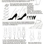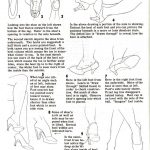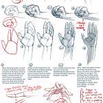
Hand Tutorial 2 by *Qinni
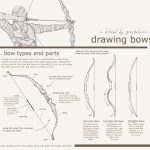
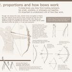
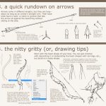
okay guys someone the other day asked for a bow tutorial so here it is! :> I hope it is helpful.
It’s not exactly the most precise archery information but I included what was relevant in terms of actually drawing—and remember as always, references are great in addition to looking through tutorials
am I even qualified enough to make a tutorial? oh well it was funTumblr made them weeny but the magnifying glass will take you to full view
OR
As an ex-archer, I can confirm these are reliable notes!
How to Draw the Head from Any Angle (via ProkoTV)
(via Parka Blogs)


Source: FOERVRAENGD
List of tutorials that helped me with environmental painting:
“How to make your own Perspective Grid in PS” <—- this one is the best thing I’ve ever discovered. Srsly CHECK IT OOOOUUUUT!
Snuffen’s Background Tutorial P1More or less ALL tutorials by Griffsnuff is awesome, so make sure to check out the rest of them!
More or less ALL tutorials made by AquaSixio!List of youtube channels that also helped and inspired me:
FZDSCHOOL – More or less one of the most known concept art-related resources I know on youtube. It’s great to sit and draw and just listen to the talking.
SinixDesign– This guy is also great! He has some design workshops ever now and then where the viewers can send in their stuff for critique! very encouraging and inspiring!
moatddtutorials– This guy is more into drawing than painting, and has a more cartoony style. He has interesting methods when it comes to perspective. And he also challenge himself in some of his videos (the engine block video is a great example of this)
foxOrian– Also known here on dA for his awesome perspective and composition tutorials. He has a youtube channel where he posts some videos that might be interesting as well.
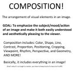
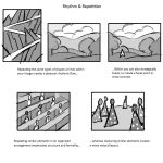
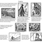
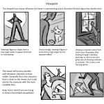
Today I gave my students a quick presentation on some of the basic considerations for composition, which I am now sharing with you! I’ve given them separate talks about color and tonal value/contrast, which are also super important compositional concerns. (I’ll be sharing those presentations too once I properly format them)
I personally love learning about different compositional techniques. It’s fun to think about the ways that the brain views & sorts images, and how we can trick it into feeling a certain way or looking at certain aspects of an image first! It’s easy to fall into compositional ruts (which I am also guilty of) because a lot of art gets by with mediocre, though serviceable, compositions. If you can generally understand what’s happening in an image then it’s generally fine. However, it’s the truly great compositions, where everything in the whole image has been considered and ‘clicks’ together, that bump up an illustration to a visual slam dunk. NC Wyeth is one of my favorite artists for this reason: his compositions are rock solid, varied based on the image’s intent, and always enhance the mood or action he is depicting.
For extra reading, some online compositional resources that I’ve found helpful or interesting include:
Creative Illustration by Andrew Loomis (download it for FREE. Such a great book all-around.)
Gurney Journey (check out the “Composition” tag, but really everything he posts is great)
The Schweitzer guide to spotting tangents
Cinemosaic (a blog by Lou Romano with some truly WONDERFUL compositions captured from various films)
Where to Put the Cow by Anita GriffinHappy composition-ing!
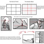
A solid breakdown of the fundamentals of composition, complete with examples!
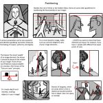
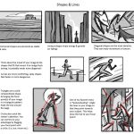
(tutorial)
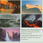
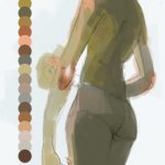
i just did a cool thing that i think would be useful if you’re like me and sometimes have a hard time picking colours / a colour scheme for an image
basically i just took a brush with moderate spacing, turned on colour dynamics and set all the hue/sat/brightness to a low (~10%-30%) jitter, picked a base colour, and drew a line down the side of the canvas
it’s sort of like when some people save colour swatches so they can keep their shading consistent, but more for playing around with different tones and lighting on a single surface. it’ll probably be pretty good for skin which is very multi-tonal by nature.
a lot of colours came out that i probably wouldn’t have picked manually, but they still looked pretty cool. and it saves a lot of time because now i have a broad range of colours without having to browse through my pantone swatches or open up the colour picker.
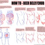
I WAS REQUESTED TO DO THIS
UH
Here’s how to draw beer bellies and chubbier dudes!
I hope this is helpful to someone. Thanks to Mammon for helping me fix some errors!
Here is a full-size version in case tumblr eats it.(i should stop making tutorials i’m not even good enough for that…)
reblogging for contemplatingchicken
why thank you! one of my (many) ambitions is to do art with a variety of body shapes in it.
(Hum somehow this reminds me that at some point I think I might buy the Fat Ladies in Spaaaaaaace coloring book.)
This is cool!
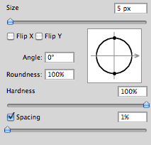
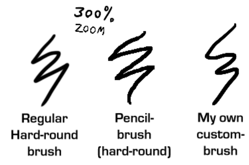
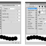
I like sharp lines when I make lineart digitally. But I don’t think the default “hard-round” brush is that sharp enough for my taste. And I really don’t wanna resize my images too much just to make the lineart appear sharper.
So I discovered how you can make the brush a bit more sharper, but not too sharp so it would look like it was made in Microsoft Paint…
First off, make sure that you set the spacing to 1%. (I do this to more or less all my brushes since I don’t like how the spacing look when you set a lower flow/pressure setting)
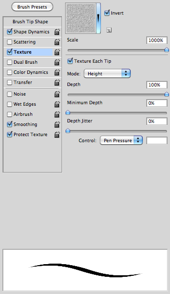
After that, check the box “Texture” and then under the options check the box “Texture each tip” and have 100% depth. This is was makes the brush a bit more sharp – this is much better than adding the “noise” effect.
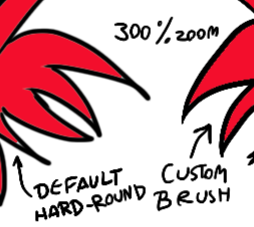
And here’s some comparing examples of the brush:
Using the Fill Bucket is also a bit better with the custom-brush than with the default. (Note the thin, light line between the black and the red on the example to the left.)
Now go make sweet lineart!