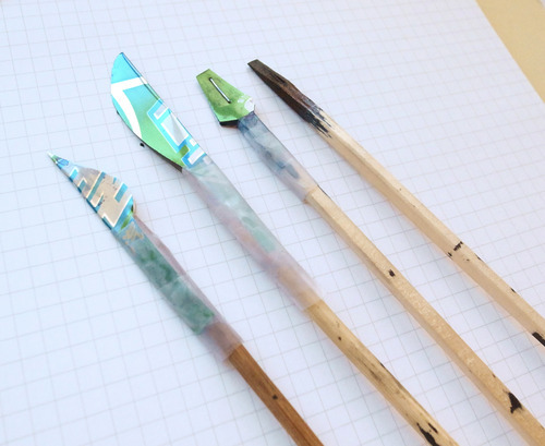
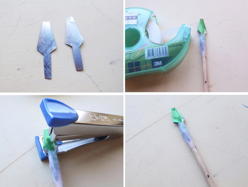
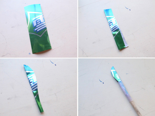
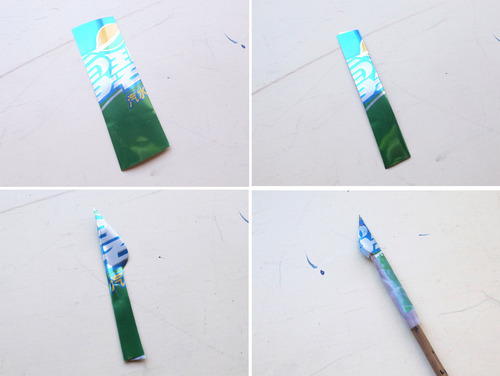
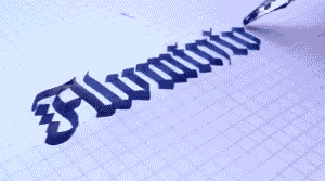
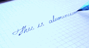
ARE YOU FUCKIN SERIOUS I’VE SPENT SHIT TONS OF MONEY ON CALLIGRAPHY PENS FOR ART AND YOU’RE TELLING ME I CAN MAKE MY OWN FOR LESS THAN 4 FRIGGEN DOLLARS??? THIS IS BULLSHIT MY ENTIRE ART LIFE IS A LIE
so i just found a really great website called tilemachine, and its basically a galler of repeating backgrounds and also a repeating background maker! it’s very simple to use, if you’re looking for a repeating background id suggest giving this one a shot!
Dunno when I’d use this, but it could come in handy!
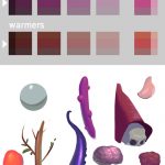
Paul Richards here made a cool photoshop document that would reveal a complement of your color after using the paint bucket tool on a layer. It also shows various cool and warm tones of that color.
I’ve been having fun with it. Coloring my value sketches and such.
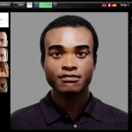
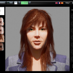
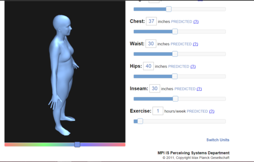
It seems that it’s out of beta now, and they have not only added a female model with long hair, but also added a POC!
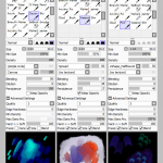
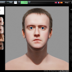
“VLS” is a very very very good resource, despite the slightly oddly designed faces, when it comes to how light falls on the face. You can add several light sources, add ambient light, add colored light, move the position of the “lamp” and other nice features.
I especially like that they added a POC model, mostly because there’s so little art-related resources when it comes to different skin color (color-palettes doesn’t count). And considering the fear of unintentional white-washing, this tool will come in handy.
Although I was hoping for another model with even darker skin color, but I guess this is good enough for now. The face looks a bit weird… but I must say the white guy is much more creepy-looking lol.
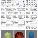
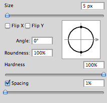
I like sharp lines when I make lineart digitally. But I don’t think the default “hard-round” brush is that sharp enough for my taste. And I really don’t wanna resize my images too much just to make the lineart appear sharper.
So I discovered how you can make the brush a bit more sharper, but not too sharp so it would look like it was made in Microsoft Paint…
First off, make sure that you set the spacing to 1%. (I do this to more or less all my brushes since I don’t like how the spacing look when you set a lower flow/pressure setting)
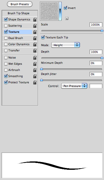
After that, check the box “Texture” and then under the options check the box “Texture each tip” and have 100% depth. This is was makes the brush a bit more sharp – this is much better than adding the “noise” effect.
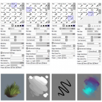
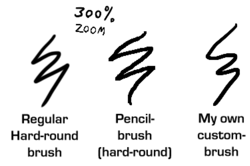
And here’s some comparing examples of the brush:
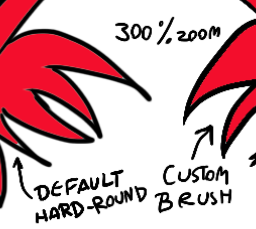
Using the Fill Bucket is also a bit better with the custom-brush than with the default. (Note the thin, light line between the black and the red on the example to the left.)
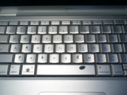
I could have used the indesign shortcuts during my 2 years in yearbook…
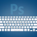
In Photoshop, you can also use the spacebar for the hand tool! I find this a lot faster than the “H” key.
Actually, you can see which shortcuts I use most just by glancing at my keyboard (Especially the spacebar and command keys, because I always tap them with my thumbnails)