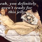
My favorite painting. I dressed up as her for Halloween.
Olympia has no fucks to give. She’s one of my favorite paintings too.
My favorite painting. I dressed up as her for Halloween.
Olympia has no fucks to give. She’s one of my favorite paintings too.
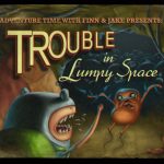
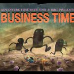

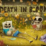

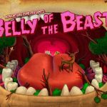
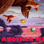
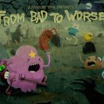
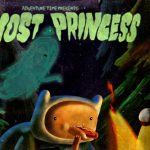
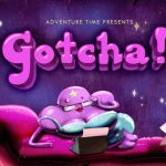
Sample of title cards from Adventure Time.They’re only on the screen for half a second, yet they deserve much longer.
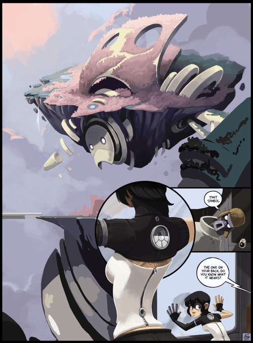
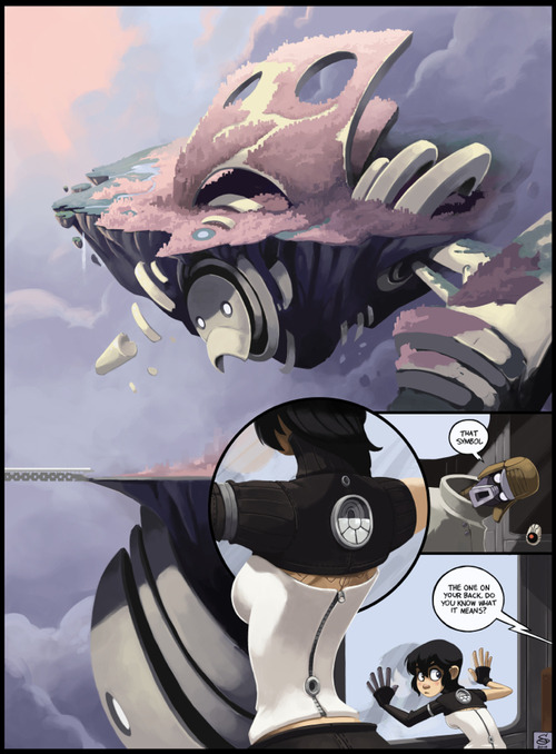
Why do you do this to me
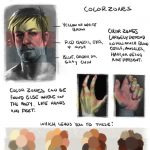
There’s a reason behind color zones, but James Gurney does a much better job at explaining it than I do. Keep in mind this doesn’t cover lighting, just the local color of skin.
Although there are ‘color palettes’ here, I really wouldn’t recommend using them for your own (as in saving the image and eye dropping them) art, I did this rather quickly so this probably not very accurate. These are just my personal preferences when it comes to color. I don’t have saved palettes; I pick colors depending on the lighting or mood as I am working on a painting. BUT IF YOU WANT TO GO RIGHT AHEAD.
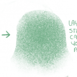
As for texture, lolidunno, I just use a lot of scatter brushes until it sort of looks like skin texture??? I honestly don’t worry about texture though unless it’s like a really close up view of a face or whatever. You can find my brushes here (you’ll need Photoshop CS or higher).
I am flattered that people are seeking advice from me, but keep in mind that I am still learning myself, so I am by no means the best person to be asking. Hope this helps you out though, anon!
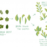
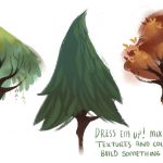
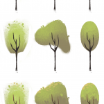
A couple people asked me how I vary my leaves and trees and honestly, it’s super easy! I’ve never made a tutorial/guide before so I kept this mega simple but I hope someone out there might find it useful at least!
Also, anyone can download the brushes I use for all my art on my tumblr page (: I only use around 5 so go nuts haha


Source: FOERVRAENGD
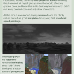
List of tutorials that helped me with environmental painting:
“How to make your own Perspective Grid in PS” <—- this one is the best thing I’ve ever discovered. Srsly CHECK IT OOOOUUUUT!
Snuffen’s Background Tutorial P1More or less ALL tutorials by Griffsnuff is awesome, so make sure to check out the rest of them!
More or less ALL tutorials made by AquaSixio!List of youtube channels that also helped and inspired me:
FZDSCHOOL – More or less one of the most known concept art-related resources I know on youtube. It’s great to sit and draw and just listen to the talking.
SinixDesign– This guy is also great! He has some design workshops ever now and then where the viewers can send in their stuff for critique! very encouraging and inspiring!
moatddtutorials– This guy is more into drawing than painting, and has a more cartoony style. He has interesting methods when it comes to perspective. And he also challenge himself in some of his videos (the engine block video is a great example of this)
foxOrian– Also known here on dA for his awesome perspective and composition tutorials. He has a youtube channel where he posts some videos that might be interesting as well.
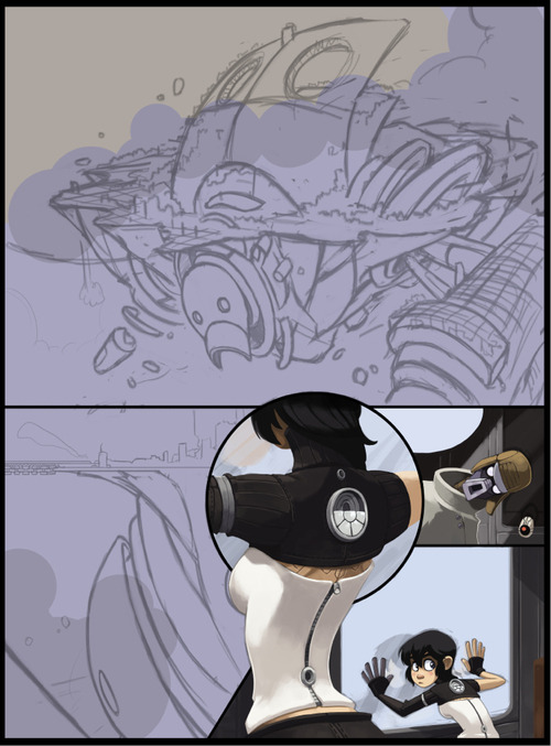
It starts with a rough outline. For Dark Science I have a basic script and story outline, and I decided how much of that script can/should fit onto a standard page. From there I start working out what I needed to draw.
Concept Sketching
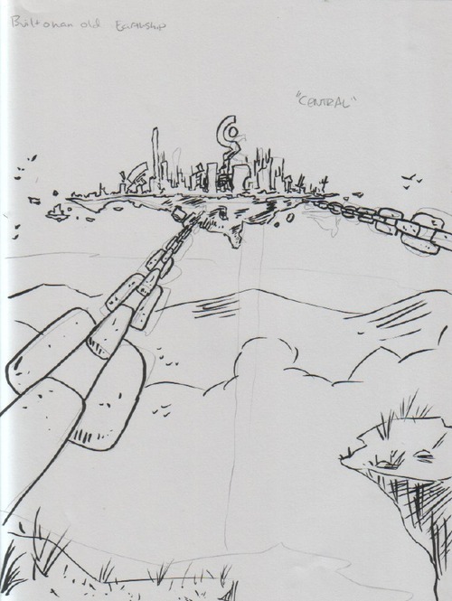
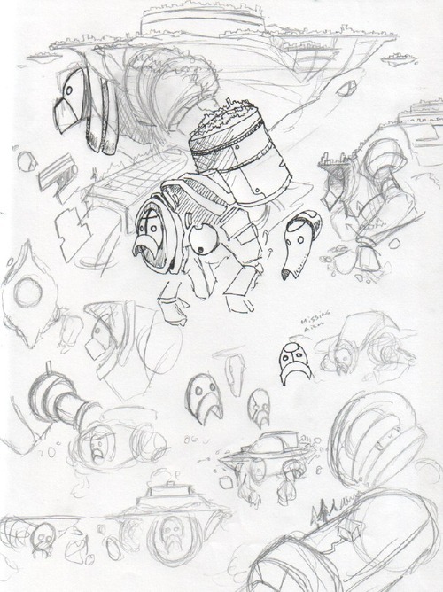
With this page I started with sketching Nephilopolis. Having written the story ahead of time, I already had a rough idea of what I wanted, but not the details. I started by going back to my first sketch of the island I did months ago (before I’d finished the plot).
A very rough idea at this point. Once I got to this page in the story and actually solidified the notes about the setting, I began fleshing it out:
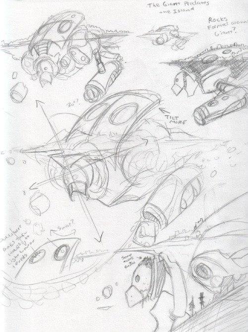
Here I’m just sketching out possible elements. I wanted to make the head clearly recognizable, and also for the giant’s shapes to contrast clearly with the shapes of the island. At this stage the design was still fairly symmetrical. After I was comfortable with the basic idea, I set the giant at an angle to the island and worked on more details:
Although at this point the design wasn’t “finished,” but it was enough to get started on thumbnailing the comic:
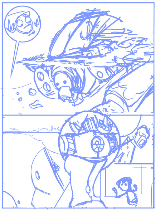
Thumbnail
Using a standard hard round brush in Photoshop, I quickly and roughly start working on the basic layout of the page. From the “script” I have directions as to what needs to happen in the scene, but I don’t worry about the specifics of the dialog until later, as it will depend on how the images end up shaping.
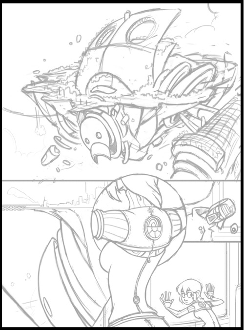
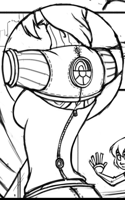
Pencils
Using a textured brush that looks a bit like pencil (there’s no need for this, just a personal preference), I start “pencilling” the page, solidifying the forms and rendering all the details that I don’t want to forget about when I start to color. With the Nephilopolis island I left things rougher, as I know from experience with landscapes that I end up improvising a lot when I start painting. By contrast, Kimiko and the stranger are tightly rendered, as they’ve already been fully designed and introduced in previous pages.
Painting
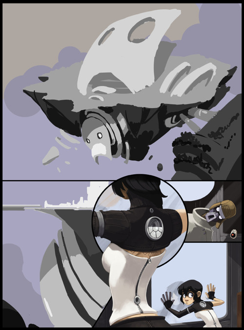
I’ll use a specific section to illustrate the steps I normally take with painting.
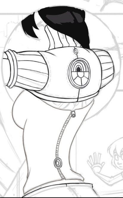
Step 1: Colored Lines
Using a round hard brush with pressure sensitivity controlling both opacity and size, I draw out the basic outlines. Even though often these outlines won’t be visible, it’s a good starting point for blocking in colors for the next step and ensuring the edges of the figure are smooth. I only generally use this step for figures, as I tend to give them sharper edges so they’ll pop out a bit.
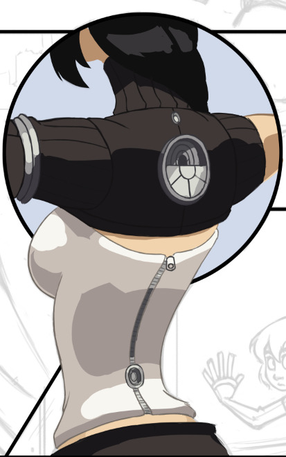
Step 2: Blocking in Colors
Underneath the lines layer I start filling in the basic colors. I’m not concerned with detailed shadows and lighting just yet, only making sure the general colors are where they need to be. At this point I’m working with four layers: one set of lines & colors that go underneath the black borders (the top half) and one set that go on top of the borders (bottom half).
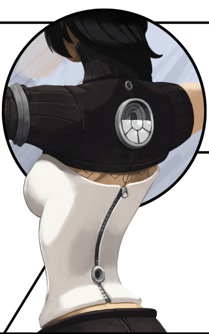
Step 3: Flatten and Render
From here I flatten the color layers with their respective line layers and, with a round brush set to opacity sensitivity (no size sensitivity), I begin painting. As you can see, some of the lines I’ve left and some I’ve removed; it all depends on what’s needed. Also note that this actually looks slightly different from the “finished” torso in the comic, as I went back a couple times and tweaked some details. No piece of the comic is totally finished until everything is finished.
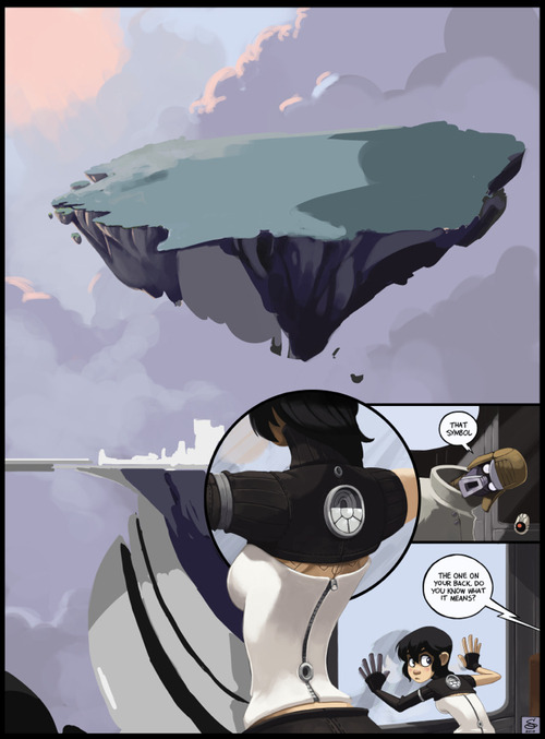
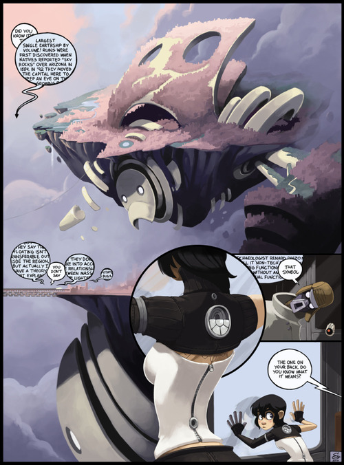
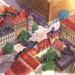
Rendering the Island
With this page I started with the “known” elements (Kimiko, the stranger and the train car all had set designs and shapes) and worked my way to the “unknown” (the island). I dropped in a basic filler for the sky and started to think about the tonal values.
Setting up Tones
For a very complex image that you haven’t painted before, it’s easy to jump into it with lots of colors, guns blazing, but you run the risk of losing appropriate contrast and overworking key areas. For these situations I prefer to make a grayscale “underpainting,” where I work out the appropriate tones. I don’t allow myself to blend anything or use colors at this point. Once I’m satisfied with the basic lighting, I move on to color selection.
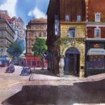
Here I’ve begun testing colors. I decided at this point to remove some of the border lines. I found them to be distracting as I started to have a better view of the composition. I’ve also moved the robot portions to their own layer and hidden it for the time being, letting me focus on color selection and rendering of the rock and island portions.
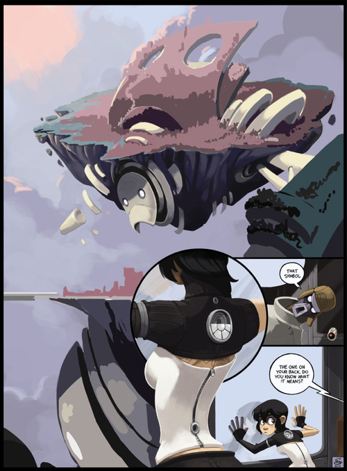
Rendering the robot portions begins, leaving the details of the top portion sparse for now, as it will be mostly covered by the city portion.
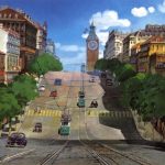
Toying around with the colors of the cityscape. Not concerned with details yet.
Most of the city is rendered at this point. I’m leaving the robot’s arm until later, as I’m not satisfied with how it’s playing against the rest of the picture.
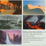
Nearing completion. Fleshed out the clouds and added some contrast. Still toying with the arm.
Finished up the arm, and added the final text bubbles. Done!
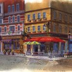
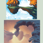
Basically done with this though I might touch it up if I’m in the mood for it later.
FFFFFFFF Emy you are way too good at digital painting. This is so beautiful, it’s like an old-school ink drawing, but in COLOR. Texturesssss <3