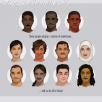
people ask me a lot about drawing poc, more specifically “how” to do it. my kneejerk reaction is to get frustrated by it, because the answer is “just like you’d draw anything else.” it’s like the main excuse artists and writers use to not include poc in their art and in their worlds — they “don’t know how,” implying that we somehow operate by a separate set of rules, that while white characters don’t require a special set of considerations to be varied and textured and interesting, non-white characters are just an elusive series of step-by-step instructions that most creators just can’t be assed to learn or to include
i still feel that way
but
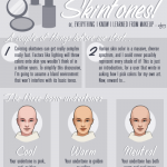
i guess i can understand that most instructive media focuses specifically on white aesthetics, proportions, skintones, and features, so there really is a need for more instructive material that is more inclusive
i can dig it
that said, there is a lot that i don’t know and am not good at and i don’t really feel comfortable trying to instruct other artists, but i’m fine with taking you through my thought processes a little
SO here’s some stuff about skintones. it’s not perfect, and there will never be a better teacher than the world around you for showing you what things look like and how to express them
first off, if you’ve ever seen me stream you know i don’t usually block in my shading with hard lines like this. i like to paint and sample colors as i go, but i’m trying to communicate my ideas about color a little better
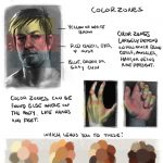
but i’ve always used the same basic process for coloring skintones, any skintones, forever and always:
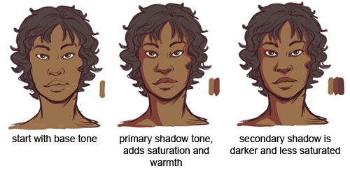
this is going to change up a little bit with directional lighting, colored lighting, environmental lighting, shit like that, but this is your basic procedure. the biggest mistake i think artists make is using skintone+black for shadows and skintone + white for highlights, and that results in pretty dull looking skintones
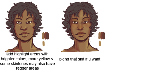
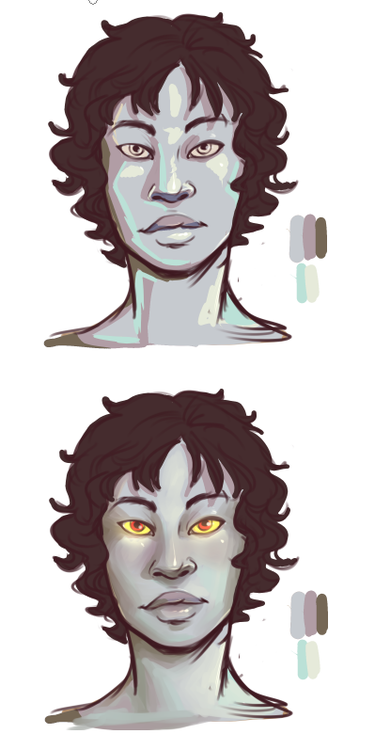
in the former image, i only varied the value of the main skin color, but in the latter i also varied the hue and saturation. doing so gives you more of an opportunity to add warmth and depth to your colors, as well as bring in environmental colors if you need to
you want to sample around the palette, use reds and purples and oranges, don’t just stay within the range of your base tone!
this applies for all colors, not just skin, but especially skin! you want skin to look alive, not plastic and dull
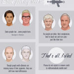
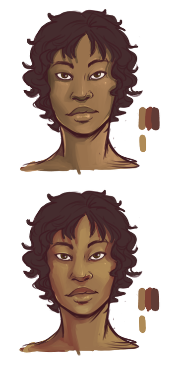
these same rules apply for most skintones
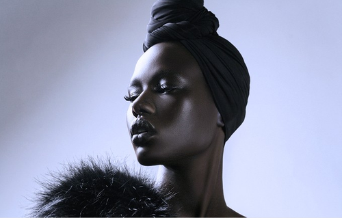
though it’s always going to be incredibly helpful to just look at references of the skintone you’re trying to draw, for little details like (for example), very dark skin, because there is a more extreme light/dark variation, will often look much more reflective than very light skin under the same lighting conditions
like so
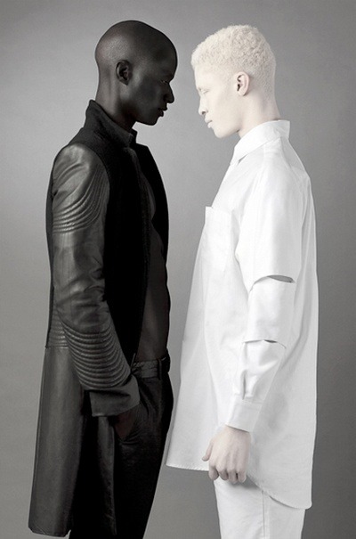
because of this, you’ll want to work on using light more than shadow to describe form on dark skin
again, this is true of all colors, but especially skin, because you don’t want skin to look flat and lifeless!
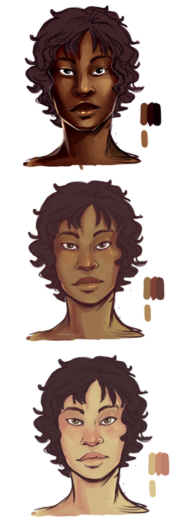
the same rules can apply to fantasy skin tones. start with a base tone, then use warm, saturated colors to add light and shadow. sampling around the palette becomes really important for fantasy skintones if you are trying to make them look realistic/believable
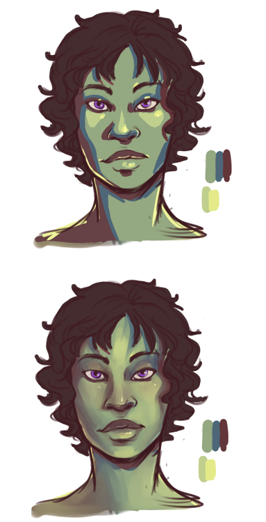
this is especially true if, for whatever reason, you wanted to make a character with grey skin that looks alive and believable
OKAY THAT’S THE END OF OUR SHOW