So I ended up writing a whole tangent about how I construct, Trying Human, these days. SORRY. I hope you can find the answer to your question in these ramblings.
More
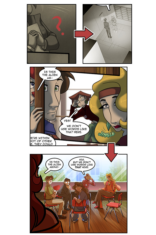
staging shots. These are long shots of the characters, where they
are in their environment, and in relation to each other. I try to
have at least one staging shot within a panel or two of a scene
starting up. Even if I’ve been to that location a million times *cough*Rose’s apartment*cough*, I still want the reader to know
where everyone is.
Less
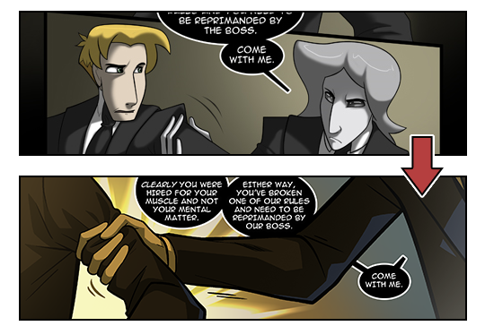
talking heads. This is a little unavoidable in comic largely driven
by dialogue and drama, but I try to not just have yo-yo-ing back and
forth between headshots of the characters. There’s a lot of this
in the old pages so a way I’ve gotten around it is by combining
panels of characters talking or completely cutting out shots and
having the ‘missing’ character’s dialogue come from off panel.
I also add in their names so we know who’s talking to who i.e.,
“Longus, thanks for letting me come over” as opposed to “Thanks
for letting me come over.” It’s a quick and dirty way to let the
reader know who said what if they’re off panel.
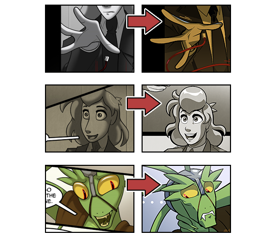
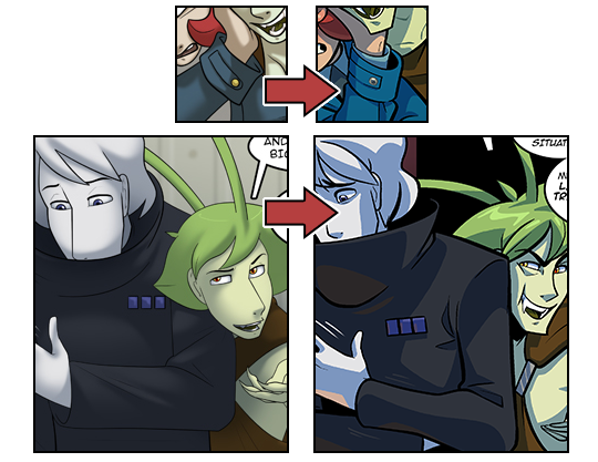
Show
all hands, feet, heads, and props (if they’re in the shot at
all…) This is kind of related the last point. I try to move
everyone’s hands and arms up into the panels. Or lower their
heads. I used to cut off a lot of body parts or just not have them
moving their limbs at all. I mean, with the Greys, I still don’t
move them but that’s a part of their species. I think it makes
them seem more creepy as well if all the other characters are talking
and gesticulating and they’re just standing around.
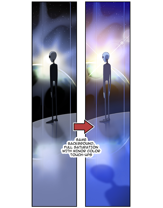
Don’t
completely desaturate your colors. I don’t know what I was
thinking but when I originally shaded TH, I did so with grey for
like… everything. I feel like I must have seen something somewhere
and thought it was a good idea, which is weird because a lot of my
non-TH art from the time didn’t suffer from this. lol ANYWAY,
frequently I’m reusing old backgrounds on the redone pages and all
I’ve done is knock the saturation way up. They look brand new! :D
More
beta-ing/spot blacking.I’m not sure what this is called in English but Spot blacking; Thanks @randumbdaze! In manga, the large swathes of flat black both in the background and on
the characters is called beta. There’s a lot more of that in TH.
Waaay more black. LOVE THE BLACK. On comic pages that are just
pencils this is usually marked with an ‘X’. If you’ve ever
been to my streams, you’ll see me marking my betas before filling
them in later. They just make the comic look more… Finished or fuller or complete. I can’t really explain it, you just have to take my word for it. In TH this is most noticeable on the inside of sleeves, collars, under characters chins, in side of mouths and on the bodies’ and in the eyes of the Greys. I also have black from the comic gutters (the area between frames) encroach into the scenes to help give the pages rhythm and break up the staging.
Less
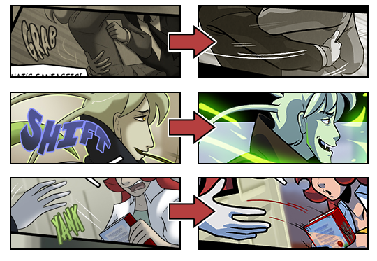
non-western style comic book sound effects.
In Japanese comics, it’s really common to see sound effects like,
“Poke!”, “Grab!”, “Smiles!” (つん,
ざっく,
うはうは,
respectively.)
That’s
because they have actual onomatopoeia
for a lot of that stuff. We don’t and it can come off as
awkward in English unless
you’re going for a really particular style to your comic.
I used to use it as a crutch
to get around actually drawing stuff out of my comfort zone, I think.
This was like 10 years ago so bear with me. I take out SFX that
aren’t actual sounds and just try to draw my actions better. Also,
TH doesn’t really feel like a manga in visual presentation so I
can’t really get away with those kind of sound effects. Worse comes to worse, you can always add a piece of dialogue like “Don’t grab me like that!” to help the reader understand what is going on.
Less
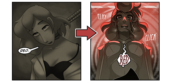
sexy when sexy doesn’t need to be there. I’m a piece of shit and draw everyone in too sexy of poses. Mostly the ladies because I have a prooooblem. ;A; I’m trying to avoid that these days unless it calls for it. Weirdly, less is more. When I try to avoid drawing them sexy, I think they look more attractive. I’m a fickle boop.
Blambot Comic Fonts & Lettering – http://www.blambot.com/ Check out their articles; they’re really helpful for creating a groundwork.
DesignDoll – http://terawell.net/terawell/ Step aside, PoseManiacs, DesignDoll is here to stay. The free version doesn’t let you save, but if you just want to throw together some poses for reference, this is a great program for that.
AIM, Aol’s instant messaging service, is to shut down December 15 after 20 years of operation. Once a near-universal form of communication for a certain generation of internet users–even those who wouldn’t be caught dead paying for Aol’s internet service!–AIM slowly faded in the age of Google and Slack and ultimately died of corporate abuse and neglect. They are, however, collecting “Aimemories” to remember the good times by.
This feels like the realest group of designers (also the twins are there) I’ve ever seen on this show. Like, they are all driven and creative people who are there to make good clothes and behave respectfully, are PROFESSIONAL about this whole thing.
And then, JUST TO FUCK WITH ME, the producers were like ‘yes hmmm this will piss her off nicely’ and threw in the twins. I HAVE TO ADMIT I REALLY WANT TO SEE WHAT’S NEXT. Damn. That’s how they getcha.
Over in the real competition, I pretty much like everyone, but Kenya and Samantha seem really cool and remind me of some of my friends. Also I think Margarita and I would like a lot of the same things and have fun hanging out.