Few would argue that there’s no benefit in increasing your verbal vocabulary. Having a larger set of words from which to choose not only allows you to articulate your thoughts more clearly to an audience, it presents a more sophisticated mental framework for the genesis of your own ideas. There’s a greater pool of resources at your disposal. Even if you don’t directly use all the words you’re able, having them there, capable of flowing naturally, multiplies your capacity for expression.
The same is true for drawing skills, especially when it comes to cartooning. As has been discussed before, the nature of the visual narrative is that a cartoonist is writing with images. The more well-rounded the skills of that artist, the more diverse and effective the visual narrative can become. Draftsmanship, in particular, can be defined as the capacity to effectively illustrate, regardless of context.
Clarity of Expression
This is the most obvious advantage. Being able to draw a variety of things well means the tools at your disposal are effective and diverse. For example, being able to draw figures is good, but being able to draw an infinite number of variations of that figure means you’re able to instinctively select the most appropriate pose/gesture/etc. for a scene.
Style is Grounded in Realism
While this is a fairly simple concept, you’d be surprised how often it’s overlooked. Most comics don’t benefit from extreme realism, but the ability to render things realistically strengthens and expands your capacity to stylize your art. If, for example, you’re poor at drawing hands, any attempt to stylize or minimalize the details in cartoon hands are going to be limited, in both style and expressiveness.
Learning to draw based exclusively on the drawings of others (like, say, manga) is going to severely limit your skills, because you’re not actually learning to draw the forms upon which the style is based. You have to know the rules before you can adequately break them.
Visual Flexibility = Mental Flexibility
In short, the more things you can draw intuitively, the more creative you can become. It’s true! When sketching or even doodling, our brains tend to default to shapes and forms we find easiest to draw; expanding our visual vocabulary expands the amount of default forms we can draw, and by extension, the diversity of concepts that can easily flow while brainstorming.
Often, being able to draw new things presents us with ideas we’d otherwise never consider. Also, simply being comfortable with drawing more things means you’re instinctively more likely to try new things. This applies to both visual design (coming up with new objects/locations) as well as raw ideas. You may not get an idea to write a scene/comic/joke about an Aztec flying machine unless you were comfortable drawing those basic forms. Likewise, without an artist having the prerequisite drawing experience, he or she may not get the idea to set a scene in a 17th century pirate cove rather than a college dorm room. It’s not so much that a less well-rounded artist couldn’t draw these things, it’s that he or she is less likely to even consider it, as it’s outside the comfort zone. It’s important to push our boundaries, but if we’re too uncomfortable with every visual element of a project, ideas aren’t going to flow naturally, and we’re actually incapable of challenging ourselves effectively.
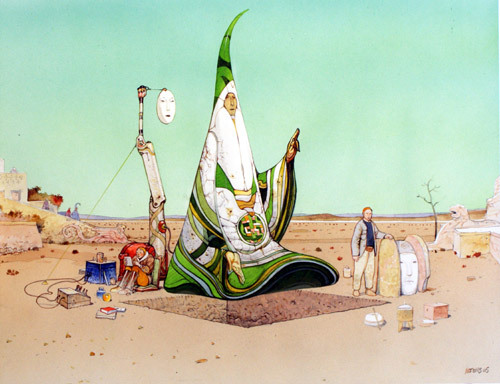
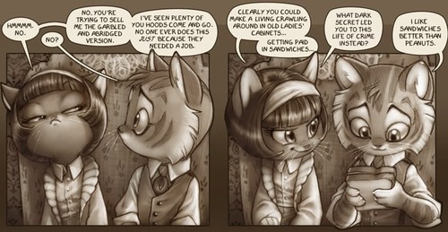
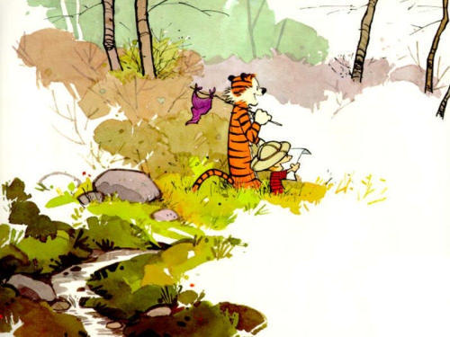
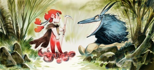
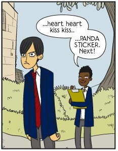
If you look for it, you can tell when an artist is extremely skilled, regardless of how complex or simple their style may be. They challenge themselves, and their art and writing is dynamic:
A strong vocabulary means not just having tools at your disposal, but being comfortable using them. Even if you’re drawing something as simple as a stickman comic, having a foundation of strong draftsmanship expands your creative potential a hundredfold.
Month: March 2013
Untitled
Do you guys remember the awesome tool Virtual Lighting Studio?
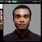
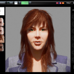
It seems that it’s out of beta now, and they have not only added a female model with long hair, but also added a POC!“VLS” is a very very very good resource, despite the slightly oddly designed faces, when it comes to how light falls on the face. You can add several light sources, add ambient light, add colored light, move the position of the “lamp” and other nice features.
I especially like that they added a POC model, mostly because there’s so little art-related resources when it comes to different skin color (color-palettes doesn’t count). And considering the fear of unintentional white-washing, this tool will come in handy.
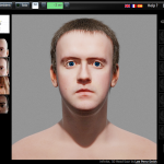
Although I was hoping for another model with even darker skin color, but I guess this is good enough for now. The face looks a bit weird… but I must say the white guy is much more creepy-looking lol.
Untitled
The eBook edition of Part 4 is now available for purchase. :)
Volume I Release Schedule:
- Part 1: February 13th
- Part 2: February 27th
- Part 3: March 13th
- Part 4: March 27th
- Part 5: April 10th
- Part 6: April 24th
- Volume I: May 8th
30 Days of World Building: Master List
- Day 1: Climate & Variety
- Day 2: Physical Planet
- Day 3: Mood & Setting
- Day 4: Cataclysms
- Day 5: The Map
- Day 6: Races
- Day 7: Recent History
- Day 8: Econ & Politics
- Day 9: Language
- Day 10: Mood & Culture
- Day 11: Focus In
- Day 12: What If
- Day 13: Plot Hooks
- Day 14: Education
- Day 15: Resources
- Day 16: Limits of Spec
- Day 17: Mood II
- Day 18: Spec & Society
- Day 19: Character
- Day 20: Plot Hooks
- Day 21: Flora & Fauna
- Day 22: Geography
- Day 23: Culture II
- Day 24: Mood III
- Day 25: Sky
- Day 26: Anti-What If
- Day 27: Plot Hooks
- Day 28: Left Out
- Day 29: Character II
- Day 30: Last Day
- Burnout Bonus
How a Dresden Codak Page is Made
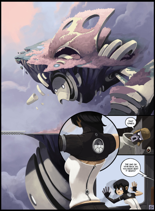
It starts with a rough outline. For Dark Science I have a basic script and story outline, and I decided how much of that script can/should fit onto a standard page. From there I start working out what I needed to draw.
Concept Sketching
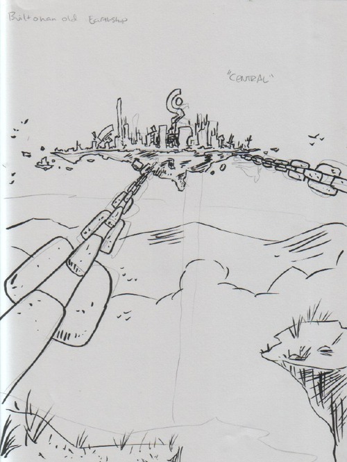
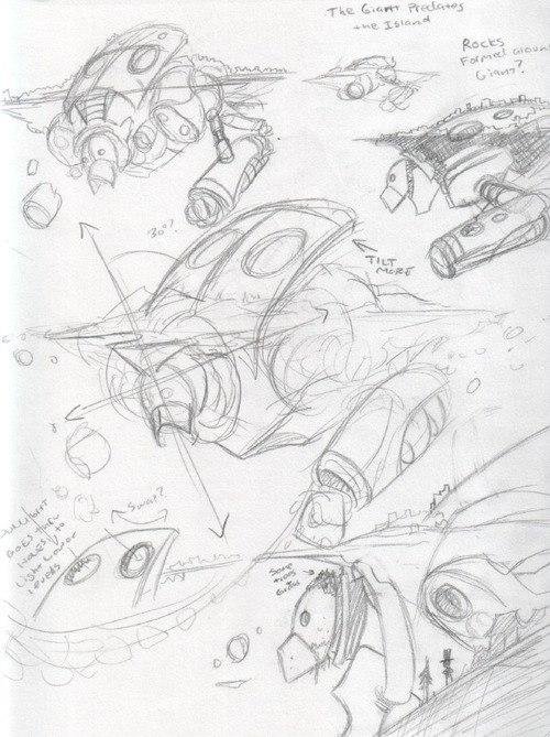
With this page I started with sketching Nephilopolis. Having written the story ahead of time, I already had a rough idea of what I wanted, but not the details. I started by going back to my first sketch of the island I did months ago (before I’d finished the plot).
A very rough idea at this point. Once I got to this page in the story and actually solidified the notes about the setting, I began fleshing it out:
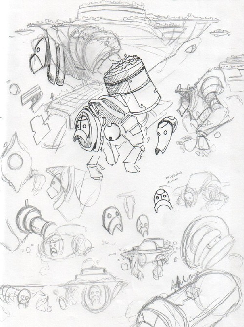
Here I’m just sketching out possible elements. I wanted to make the head clearly recognizable, and also for the giant’s shapes to contrast clearly with the shapes of the island. At this stage the design was still fairly symmetrical. After I was comfortable with the basic idea, I set the giant at an angle to the island and worked on more details:
Although at this point the design wasn’t “finished,” but it was enough to get started on thumbnailing the comic:
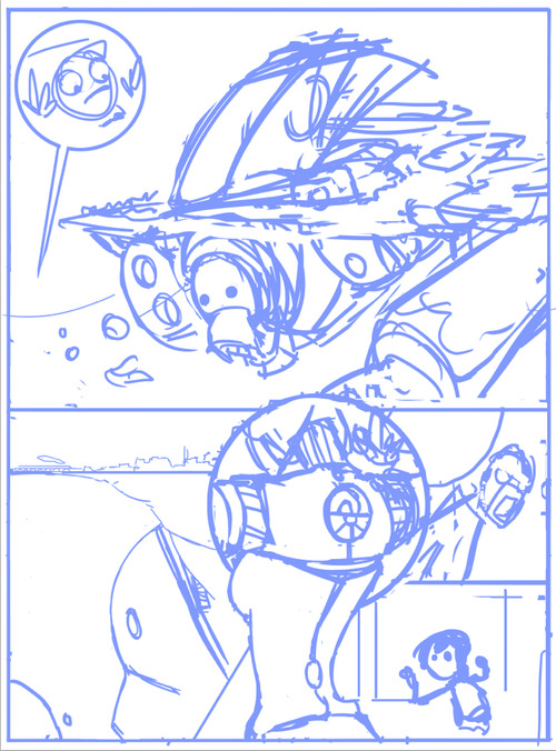
Thumbnail
Using a standard hard round brush in Photoshop, I quickly and roughly start working on the basic layout of the page. From the “script” I have directions as to what needs to happen in the scene, but I don’t worry about the specifics of the dialog until later, as it will depend on how the images end up shaping.
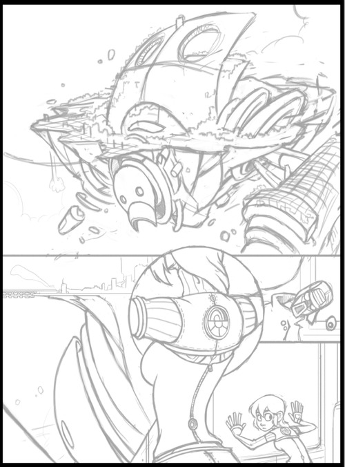
Pencils
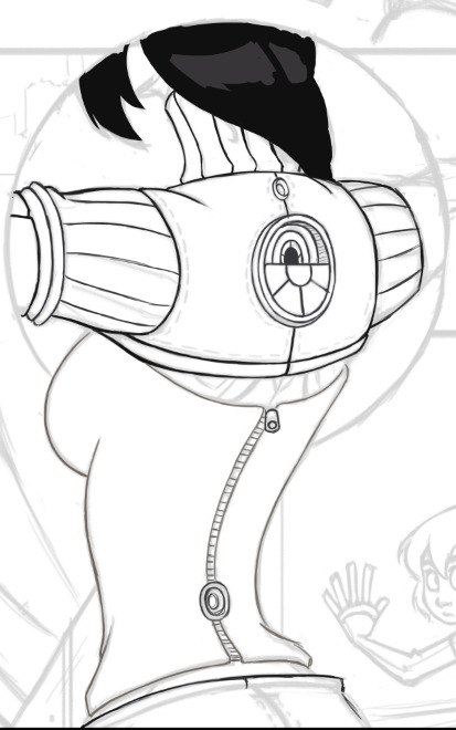
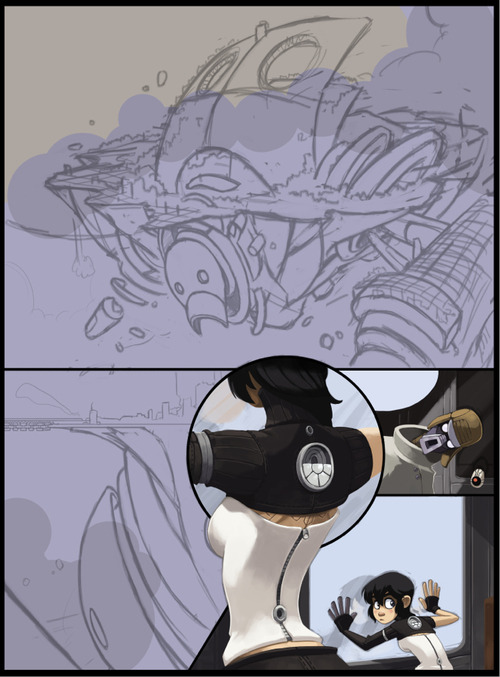
Using a textured brush that looks a bit like pencil (there’s no need for this, just a personal preference), I start “pencilling” the page, solidifying the forms and rendering all the details that I don’t want to forget about when I start to color. With the Nephilopolis island I left things rougher, as I know from experience with landscapes that I end up improvising a lot when I start painting. By contrast, Kimiko and the stranger are tightly rendered, as they’ve already been fully designed and introduced in previous pages.
Painting
I’ll use a specific section to illustrate the steps I normally take with painting.
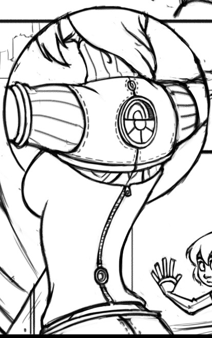
Step 1: Colored Lines
Using a round hard brush with pressure sensitivity controlling both opacity and size, I draw out the basic outlines. Even though often these outlines won’t be visible, it’s a good starting point for blocking in colors for the next step and ensuring the edges of the figure are smooth. I only generally use this step for figures, as I tend to give them sharper edges so they’ll pop out a bit.
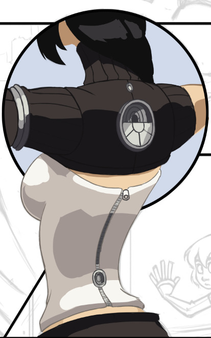
Step 2: Blocking in Colors
Underneath the lines layer I start filling in the basic colors. I’m not concerned with detailed shadows and lighting just yet, only making sure the general colors are where they need to be. At this point I’m working with four layers: one set of lines & colors that go underneath the black borders (the top half) and one set that go on top of the borders (bottom half).
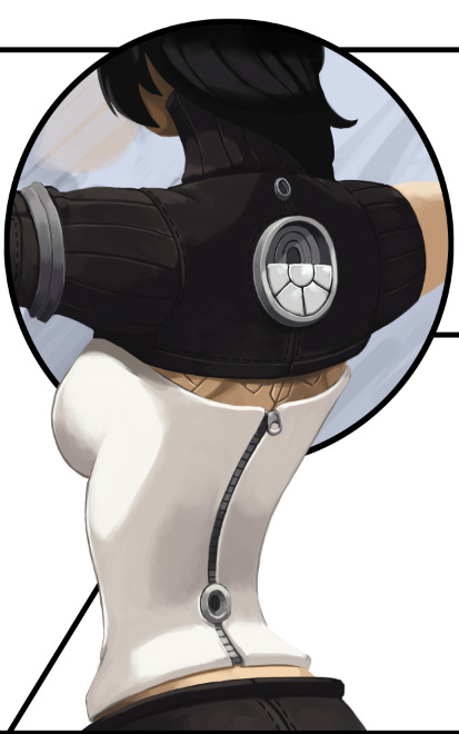
Step 3: Flatten and Render
From here I flatten the color layers with their respective line layers and, with a round brush set to opacity sensitivity (no size sensitivity), I begin painting. As you can see, some of the lines I’ve left and some I’ve removed; it all depends on what’s needed. Also note that this actually looks slightly different from the “finished” torso in the comic, as I went back a couple times and tweaked some details. No piece of the comic is totally finished until everything is finished.
Rendering the Island
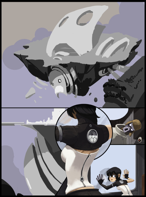
With this page I started with the “known” elements (Kimiko, the stranger and the train car all had set designs and shapes) and worked my way to the “unknown” (the island). I dropped in a basic filler for the sky and started to think about the tonal values.
Setting up Tones
For a very complex image that you haven’t painted before, it’s easy to jump into it with lots of colors, guns blazing, but you run the risk of losing appropriate contrast and overworking key areas. For these situations I prefer to make a grayscale “underpainting,” where I work out the appropriate tones. I don’t allow myself to blend anything or use colors at this point. Once I’m satisfied with the basic lighting, I move on to color selection.
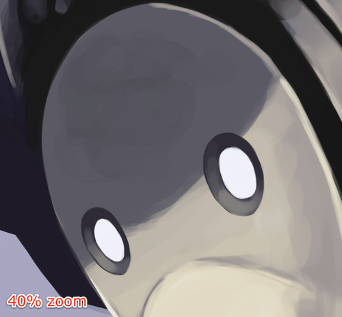
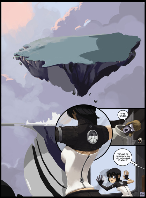
Here I’ve begun testing colors. I decided at this point to remove some of the border lines. I found them to be distracting as I started to have a better view of the composition. I’ve also moved the robot portions to their own layer and hidden it for the time being, letting me focus on color selection and rendering of the rock and island portions.
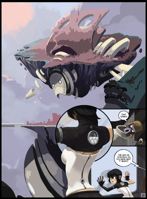
Rendering the robot portions begins, leaving the details of the top portion sparse for now, as it will be mostly covered by the city portion.
Toying around with the colors of the cityscape. Not concerned with details yet.
Most of the city is rendered at this point. I’m leaving the robot’s arm until later, as I’m not satisfied with how it’s playing against the rest of the picture.
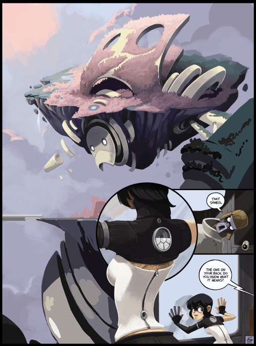
Nearing completion. Fleshed out the clouds and added some contrast. Still toying with the arm.
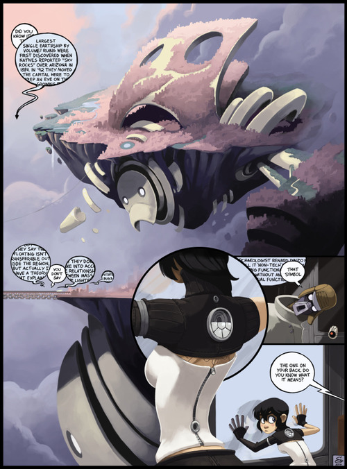
Finished up the arm, and added the final text bubbles. Done!
Untitled
I’m more excited about my new inspiration blog than about actually making art today. .__.
Ehhhhh, I’ll get over it. ^_^;
Untitled
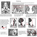
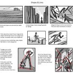
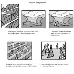
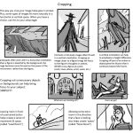
Today I gave my students a quick presentation on some of the basic considerations for composition, which I am now sharing with you! I’ve given them separate talks about color and tonal value/contrast, which are also super important compositional concerns. (I’ll be sharing those presentations too once I properly format them)
I personally love learning about different compositional techniques. It’s fun to think about the ways that the brain views & sorts images, and how we can trick it into feeling a certain way or looking at certain aspects of an image first! It’s easy to fall into compositional ruts (which I am also guilty of) because a lot of art gets by with mediocre, though serviceable, compositions. If you can generally understand what’s happening in an image then it’s generally fine. However, it’s the truly great compositions, where everything in the whole image has been considered and ‘clicks’ together, that bump up an illustration to a visual slam dunk. NC Wyeth is one of my favorite artists for this reason: his compositions are rock solid, varied based on the image’s intent, and always enhance the mood or action he is depicting.
For extra reading, some online compositional resources that I’ve found helpful or interesting include:
Creative Illustration by Andrew Loomis (download it for FREE. Such a great book all-around.)
Gurney Journey (check out the “Composition” tag, but really everything he posts is great)
The Schweitzer guide to spotting tangents
Cinemosaic (a blog by Lou Romano with some truly WONDERFUL compositions captured from various films)
Where to Put the Cow by Anita GriffinHappy composition-ing!
A solid breakdown of the fundamentals of composition, complete with examples!
