Turn your old t-shirts into a summer vest!


Japanese Wisteria Tunnel
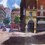
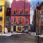
These photos were taken at the Kawachi Fuji Garden, about a four hour drive from Tokyo, but there are wisteria festivals all over Japan, including at the Kameido-Tenjin Shrine, where tourists in the Edo period often visited the famous wisteria; the Wake Wisteria Park, in Wake-cho, Okayama, and at Ashikaga Flower Park, which has three massive wisteria trellises that extend 3,280 feet squared. (Time Out Tokyo has a list of additional notable wisteria around the city worth visiting.)
Oh.
Wow.

They all weigh 150lbs
There is no ‘right’ body type. Weight looks different on different people, and it is ALL OKAY. Don’t compare yourself to other people’s bodies, learn to love the body you’re in NOW and what it can do NOW.


crapheadslaphead-deactivated201:
Yes Yes uYes
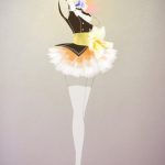
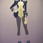
These are all amazing. And I want all of these clothes.
e1n:
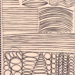
I am currently taking a class called “Visual Communications”, which apparently is the very first foundation class people take when they go to an art school. The purpose of this class is to train you so that you are confident with your lines and won’t need to scribble too much while sketching.
Our first week’s homework is training on hand stability. I’ve heard a lot of artists complain that they have “shaky hands” and so when they ink their drawings, it comes out crap, so I thought I’d share my homework with you guys.
- Draw a line about 2 inch long, as straight as you possibly can without a ruler. Go over this line EIGHT times without making the line any thicker. Repeat this exercise 10 times.
- Draw a line about half a page long, as straight as you possibly can without a ruler. Go over this line EIGHT times without making the line any thicker. Repeat this exercise 10 times.
- Draw a line from one end of the page to the opposite end, as straight as you possibly can without a ruler. Go over this line EIGHT times without making the line any thicker. Repeat this exercise 10 times.
Repeat the above exercise, but with an arc, and then with a wave.
We’re supposed to do this every day before we draw as a warm-up. Basically just keep drawing lines, arcs, and waves until you fill up an entire 8.5×11 page. Use felt-tip pens like microns/multiliner/sharpie. Keep doing this for the rest of your drawing life and your inking will get significantly better.
oh man. i gotta try this.
omg one last thing i have stumbled upon the scales and arpeggios equivalent of drawing or something this is fantastic
Oh my. This is great. This is so great.
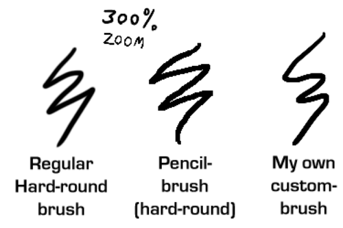
I like sharp lines when I make lineart digitally. But I don’t think the default “hard-round” brush is that sharp enough for my taste. And I really don’t wanna resize my images too much just to make the lineart appear sharper.
So I discovered how you can make the brush a bit more sharper, but not too sharp so it would look like it was made in Microsoft Paint…
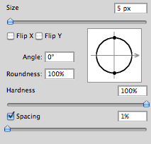
First off, make sure that you set the spacing to 1%. (I do this to more or less all my brushes since I don’t like how the spacing look when you set a lower flow/pressure setting)
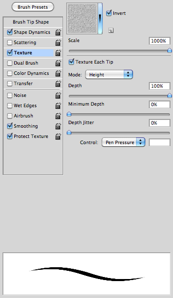
After that, check the box “Texture” and then under the options check the box “Texture each tip” and have 100% depth. This is was makes the brush a bit more sharp – this is much better than adding the “noise” effect.
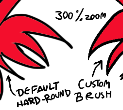
And here’s some comparing examples of the brush:
Using the Fill Bucket is also a bit better with the custom-brush than with the default. (Note the thin, light line between the black and the red on the example to the left.)
Now go make sweet lineart!
How to make the “Just add water” tool in Photoshop
woot! Not that I’m planning to do any actual painting in the near future… but you never know!
OH MY GOOOOOOOOOOOOOOOOOOD
USING THIS TECHNIQUE FOR FUCKING EVER.
OH MY GOD, MIND BLOWING
WHOOOAAAAAAA
saves for ref